






- What ecommerce website design actually means
- Why design directly impacts revenue
- How high-growth online retailers approach website design
- What a few well-known UK online retailers get right
- Not sure whether your website is helping or holding back growth?
- Characteristics of high-converting ecommerce websites
- Homepage strategy
- Collection page optimisation
- Product page optimisation
- Navigation and site search
- Site speed and Core Web Vitals
- Mobile-first design
- Accessibility and trust signals
- Checkout optimisation
- Bad design versus good design, side by side
- Design systems and brand consistency
- Research before redesign: wireframes, heatmaps and real user testing
- Personalisation and AI in ecommerce website design
- Technical SEO, internal linking and structured data
- Choosing the right ecommerce platform
- DIY builder versus a professional design agency
- Cost considerations
- The ecommerce website design readiness framework
- KPIs and how to measure design success
- Common mistakes to avoid
- Future ecommerce design trends worth watching
- How Elsner approaches ecommerce website design
- The bottom line
- Ready to find out what your website is actually costing you?
- Frequently Asked Questions
- What is ecommerce website design?
- How much does a professional ecommerce website design cost?
- Why does website speed matter so much for ecommerce conversions?
- Should a growing online retailer choose Shopify, WooCommerce or Adobe Commerce?
- What is mobile-first design and why does it matter?
- How does accessible design affect ecommerce revenue?
- What causes most shopping cart abandonment?
- How often should an ecommerce website be redesigned?
- Do product videos actually improve conversion rates?
- Is a DIY website builder good enough for a growing ecommerce business?
Most business owners find out their ecommerce website design has a problem the hard way. Traffic looks fine in analytics. Ad spend is doing its job. Then someone checks the conversion rate and it’s sitting at 0.9%, while a competitor in the same category is quietly converting at 4%. Nobody changed the product. Nobody changed the price. The website was just never built to sell in the first place, it was built to exist.
This guide breaks down what genuinely moves the needle in ecommerce website design: the structural decisions, the psychology, the technical groundwork, and the everyday mistakes that quietly cap growth. It draws on checkout research, page speed data, and accessibility figures specific to British shoppers, since a store built for a generic global audience often misses the habits and expectations of buyers closer to home. One pattern worth naming early: businesses often invest thousands in a visual refresh while leaving the same confusing category structure untouched underneath, and then wonder why conversion barely moved. Visuals rarely fix what navigation broke.
Quick Answer
Ecommerce website design is the strategic combination of visual layout, user experience, technical performance and conversion psychology that determines whether a visitor buys, browses and leaves, or bounces before the page even finishes loading. Good design isn’t decoration applied at the end of a build. It’s the structure that carries every other marketing effort, from paid ads to email campaigns, and it directly shapes revenue through speed, trust, navigation clarity and checkout flow.
What ecommerce website design actually means
Ask ten people what ecommerce website design means and most will describe colours, fonts and a homepage banner. That’s the visible 10%. The other 90% is structural: how categories are organised, how search behaves when someone mistypes a product name, how quickly a page renders on a three-year-old phone over patchy 4G, and how many form fields stand between a full basket and a completed order.
Design, in this context, is closer to engineering than art. Every layout choice is really a decision about friction. Put a filter in the wrong place and a shopper gives up scrolling through 400 products. Bury delivery costs until the final checkout step and a good chunk of that basket disappears. None of these are aesthetic failures. They’re commercial ones dressed up as design problems.
A properly built ecommerce development foundation is what makes good design possible in the first place. A theme can look beautiful in a demo and still fall apart under real catalogue size, real traffic spikes, and real payment gateway quirks. Design decisions made without that foundation tend to get expensive to fix later.
The three jobs every ecommerce page has to do
Tell the visitor where they are. Show them what to do next. Remove whatever might stop them doing it. Miss any one of those, and the rest of the page, however polished, is working against itself.
Why design directly impacts revenue
Trust forms faster than most marketers assume. Researchers at Carleton University found that people form a lasting opinion about a website’s visual appeal in as little as 50 milliseconds, long before they’ve read a headline or scrolled past the fold. That snap judgement colours everything that follows, a phenomenon researchers call the halo effect: a page that looks credible gets treated as more usable, even before anyone has actually used it.
That gap compounds fast. A store doing £500,000 a year in revenue could realistically be losing a six-figure sum simply because pages load a few seconds slower than they should. It’s rarely one dramatic fault. It’s usually a slow theme, an oversized hero image, and a dozen unused apps quietly loading scripts on every single page.
Design also carries weight long after the sale. A site that feels considered, that loads fast and checks out cleanly, earns repeat visits without a discount code doing the work. That’s the part discount-driven retailers tend to forget: good design is a retention tool, not just an acquisition one.
How high-growth online retailers approach website design
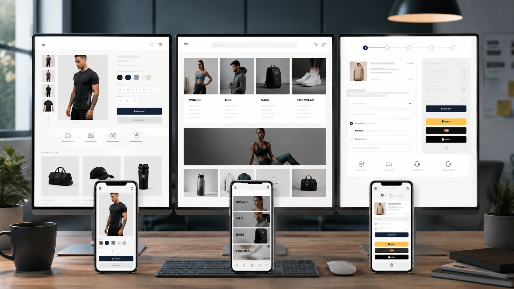
Fast-growing online retailers rarely treat their website as a finished asset. They treat it as a live system that gets tested, measured and adjusted continually, the same way a physical retailer would rearrange a shop floor after noticing where footfall clusters and where it drops off.
A few habits show up again and again among brands that scale well. They protect page speed as fiercely as they protect their brand colours. They run A/B tests on product page layout instead of guessing. They treat mobile as the primary experience, not a shrunken version of desktop. And crucially, they separate what looks good from what actually performs, since those two things overlap less often than most owners expect.
There’s also a quieter habit worth naming: restraint. Growing brands tend to remove features rather than keep adding them. Every extra badge, pop-up and carousel competes for the same limited attention a visitor brings to the page, and that attention doesn’t grow just because the homepage got busier.
What a few well-known UK online retailers get right
A handful of British DTC brands are worth studying, not as templates to copy but as evidence of how far a clear design decision can carry a category.
Gymshark builds its category pages around impulse rather than deliberation. Products carry a quick-add option so a shopper can move an item straight into the basket without ever loading the full product page, and customer photos are merchandised on-site as a genuine trust signal rather than tucked away in a separate social feed. That approach works because the catalogue has relatively few variants. A store with complicated sizing would likely see returns climb if it skipped the product page the same way.
Charlotte Tilbury solves a different problem: beauty shoppers often can’t name what they’re looking for. Rather than relying on category taxonomy alone, the site leans on a shade finder, a gift finder, and an image-led mega menu that shows the products instead of just listing them. It’s a good reminder that navigation doesn’t always need more categories, sometimes it needs a better tool.
Huel keeps its checkout deliberately minimal and leans on express wallets like Apple Pay to cut form-filling almost entirely, which suits a largely repeat-purchase, subscription-driven customer base that doesn’t want to re-enter card details every month. None of these brands got there by accident. Each design decision maps directly to how that specific audience actually shops.
Not sure whether your website is helping or holding back growth?
Elsner can review your current storefront and flag exactly where design, speed or checkout friction is costing you sales.
Characteristics of high-converting ecommerce websites
Strip away the branding and most high-converting stores share a similar skeleton underneath.
Clarity over cleverness. The homepage tells a first-time visitor what the business sells within seconds, without requiring them to scroll or guess. Clever taglines are fine once trust is established. They’re a liability before it.
A visible path from browse to buy. Category pages, filters, product pages and the basket all connect in a way that feels obvious rather than clever. Nobody should have to think about how to get to checkout.
Genuine speed, not just a good Lighthouse score. A page can score well in a lab test and still feel sluggish on a real phone with a real connection. Field data matters more than lab data here.
Trust signals placed where doubt naturally appears. Reviews near the add-to-basket button. Delivery information near the price. Security badges near the payment step. Not scattered randomly across the footer.
A checkout that respects the customer’s time. Guest checkout available by default. Costs shown early. Minimal form fields. Nothing hidden until the very last click.
Homepage strategy
The homepage carries an odd dual burden. It has to work for someone who’s never heard of the brand and for someone returning to reorder within thirty seconds. Trying to satisfy both audiences with the same static layout is usually where things go wrong.
The hero section earns its place only if it does one job well: state what the business sells, to whom, and why it’s worth a look. A rotating carousel of five different messages usually means nobody agreed on the one message that matters, so the decision got outsourced to a slideshow. Visitors rarely wait around for slide three.
Below the fold, the homepage should route people rather than entertain them. Bestsellers, new arrivals, and category entry points do more commercial work than lifestyle photography ever will, though the two aren’t mutually exclusive. A brand story has its place, but usually further down the page, once someone has already decided the products are worth their time. The pattern worth flagging here: a homepage redesign that only changes imagery and copy, while leaving the same weak routing underneath, tends to produce a nicer-looking page with the same conversion rate it had before.
Collection page optimisation
Category and collection pages get less attention than homepages and product pages, which is a mistake given how much of the shopping journey happens here. This is where a browsing visitor either narrows down to something worth clicking or gives up scrolling.
Filtering needs to reflect how customers actually think, not how the warehouse organises stock internally. Size, colour, price bracket and material usually matter more to a shopper than an internal SKU category. Filters should also update the result count live rather than forcing a page reload, since that lag is exactly the kind of friction that quietly pushes people away.
Sort order deserves more thought than the default “Featured” setting most platforms ship with. Letting a customer sort by price, newest arrivals, or bestsellers gives them a sense of control, and a shopper who feels in control browses longer rather than bouncing at the first sign of decision fatigue.
Product page optimisation
The product page is where intent turns into a decision, and it’s usually the single most under-invested page type on a site. Imagery does most of the heavy lifting. Stores that upgrade from a single flat product shot to multiple angles, zoom functionality and lifestyle context typically see conversion lifts of up to 40%, since shoppers can’t touch the product and rely entirely on what the photography tells them.
Video closes a similar gap. Shoppers who watch a product video are considerably more likely to add that item to their basket, with some research pointing to lifts as high as 144%, and 85% of consumers say a video has directly influenced a purchase decision. A thirty-second clip showing scale, texture or how something actually moves often answers three objections a written description never will.
Reviews matter more than most owners assume, particularly volume and recency. Products with eleven to thirty reviews convert noticeably better than those with only a handful, and a product’s most recent reviews influence buyers more than a stack of two-year-old ones. A product page that hides reviews below a long description is quietly working against its own conversion rate.
Description copy should answer the questions a good shop assistant would ask a customer, not repeat marketing adjectives. Fit, care instructions, what’s included in the box, and honest limitations build more trust than superlatives ever do. A related area worth reading up on is the broader difference between UX and UI design, since product page decisions usually sit right at that boundary between how something looks and how it actually functions.
Navigation and site search
Navigation should be boring, in the best sense of the word. Predictable menu labels beat clever ones every time. A visitor shouldn’t have to guess whether “Collections” or “Shop” leads to the products they want. The issue we see most often during ecommerce reviews isn’t a broken menu, it’s a menu that made perfect sense to whoever built the catalogue and none at all to the person shopping it.
Site search deserves far more investment than it usually gets. Shoppers who use on-site search convert two to three times higher than those who browse manually, because search is a direct signal of purchase intent. A search bar that fails on a misspelling, a plural, or a synonym is turning away exactly the visitors closest to buying. Autocomplete suggestions, typo tolerance and result previews aren’t luxuries on a serious storefront, they’re basic infrastructure.
Breadcrumbs are a small addition that solve a real problem: they let someone who arrived from a Google search or a paid ad understand where they’ve landed within the site, without forcing them back to the homepage to reorient themselves.
Site speed and Core Web Vitals
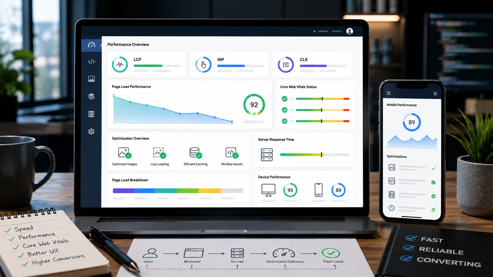
Speed is the one design factor that affects every single metric downstream of it: bounce rate, conversion rate, average order value, and search ranking. It’s also the factor most frequently sacrificed for a heavier theme, a flashier animation, or one more marketing app.
Largest Contentful Paint, Interaction to Next Paint and Cumulative Layout Shift aren’t abstract developer metrics. LCP measures how long a visitor stares at a blank or half-loaded screen. INP measures whether tapping a button actually responds. CLS measures whether the page jumps around while someone’s trying to tap “Add to Basket”, the single most infuriating layout fault on a mobile storefront.
Fixing this rarely means a full rebuild. It usually means compressing images properly, lazy-loading anything below the fold, removing apps nobody uses anymore, and auditing third-party scripts that quietly load on every page whether they’re needed there or not. A deeper breakdown of exactly where these gains come from is covered in our guide to improving Core Web Vitals scores.
Mobile-first design
Mobile now accounts for around 55 to 57% of all online retail transactions in the British market, up from roughly 38% just a few years ago, and mobile traffic share sits even higher than that at close to 80%. Designing for desktop first and shrinking it down for phones later, which is still how a surprising number of stores get built, treats the majority channel as an afterthought.
| Approach | What it actually means | Where it falls short |
|---|---|---|
| Responsive design | One layout that resizes and rearranges across screen widths | Often loads desktop-weight assets on mobile, hurting speed |
| Mobile-first design | Built for the smallest screen first, then expanded upward | Needs discipline to avoid a cramped feel once scaled to desktop |
Practically, that means thumb-reachable navigation, tap targets large enough for a real finger rather than a mouse cursor, and checkout fields that trigger the correct keyboard, numeric for card numbers, email keyboard for email fields. Small details, but they add up across a session made of dozens of taps rather than clicks. This is also where a dedicated mobile UI design pass tends to catch problems a generic responsive theme never will.
Accessibility and trust signals
Accessibility gets treated as a compliance checkbox far too often, when it’s actually one of the biggest untapped commercial opportunities in retail design. The spending power of disabled shoppers and their households, often called the purple pound, is estimated at somewhere between £274 billion and £446 billion a year.
Retailers rarely lose these customers because of a single glaring fault. It’s usually a build-up of small ones: low colour contrast, missing alt text on product images, carousels that trap keyboard navigation, and form fields with no visible label once a placeholder disappears on focus. Every one of those is fixable without a redesign.
Trust signals work on a similar principle to accessibility: they matter most exactly where a shopper hesitates. Security badges near the payment form, a visible returns policy near the price, and clear delivery timelines near the add-to-basket button all address doubt at the moment it actually appears, rather than being buried in a footer nobody scrolls to.
Checkout optimisation
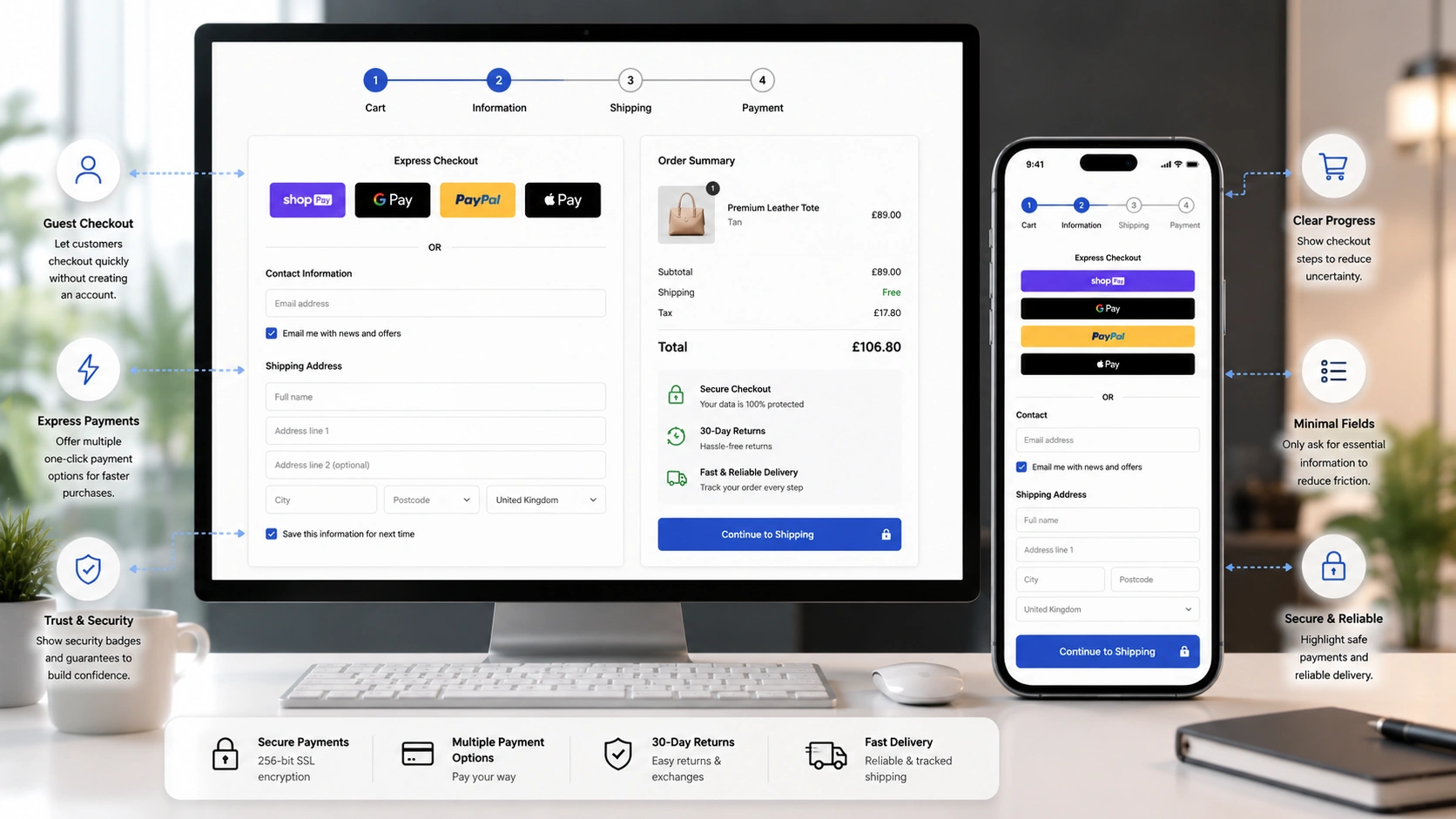
Cart abandonment sits at around 70% across the industry as a whole, a figure that has barely moved in over a decade despite constant investment in conversion tools. That stability is telling. It suggests the problem isn’t a lack of urgency banners or exit-intent pop-ups, it’s structural friction inside the checkout flow itself. We consistently see businesses treat the symptom, adding a discount pop-up, when the actual issue is a checkout that asks for the same information twice.
Baymard’s checkout research, built on years of large-scale usability testing, found that unexpected costs revealed late in checkout, shipping, taxes, fees, account for close to half of all abandonment cases. Mandatory account creation and an overly long form process each account for roughly another fifth. An ideal checkout can realistically run to twelve or fourteen form elements. The average store’s checkout shows nearly double that.
Quick wins for checkout
Show total cost, including delivery, before the final step. Offer guest checkout by default rather than forcing an account. Remove any field that isn’t strictly necessary to fulfil the order. Use a single-page or clearly numbered multi-step layout so progress feels visible rather than open-ended.
Businesses running proper conversion rate optimisation work usually treat checkout as a living system rather than a fixed template, testing field order, button copy and payment method placement rather than assuming the platform’s default checkout is already optimal.
Bad design versus good design, side by side
| Element | Bad design | Good design |
|---|---|---|
| Homepage hero | Rotating carousel with five competing messages | One clear message and one clear action |
| Product imagery | One flat photo, no zoom, no scale reference | Multiple angles, zoom, video and lifestyle context |
| Delivery costs | Revealed only at the final checkout step | Shown clearly on product and basket pages |
| Checkout account | Account creation forced before purchase | Guest checkout offered as the default path |
| Mobile navigation | Shrunk desktop menu, tiny tap targets | Thumb-friendly menu built for mobile first |
Design systems and brand consistency
A design system, a defined set of colours, typography, spacing rules and component styles, sounds like an enterprise-only concern, but it pays off just as quickly for a growing independent retailer. Without one, every new landing page or seasonal campaign gets built slightly differently, and the site slowly loses the coherence that makes a brand feel trustworthy.
Consistency also has a practical speed benefit. Reusing the same button styles, card layouts and spacing rules across the site means fewer custom stylesheets loading per page, which quietly helps performance alongside the more obvious branding benefit.
Research before redesign: wireframes, heatmaps and real user testing
Skipping straight to visual design without research is one of the more expensive habits in this industry, and it’s an easy one to fall into when a redesign feels overdue. Wireframing forces a decision about information architecture, what goes where, in what order, before anyone argues about colour palettes. It’s far cheaper to move a box on a wireframe than to rebuild a finished page because the checkout flow was structured wrong from the start.
Heatmaps and session recordings turn assumptions into evidence. Watching real visitors hesitate over a filter, rage-click a broken button, or scroll straight past a banner nobody clicks tells you more in an afternoon than a stakeholder meeting will in a month. Moderated user testing, even five sessions with real customers, routinely surfaces navigation problems that internal teams have simply stopped noticing because they know the site too well to see it fresh.
The businesses that skip this step tend to redesign based on internal opinion rather than customer behaviour, and the result usually looks better without converting any better. A deeper look at where UX research fits into the wider optimisation picture is covered in our guide to website optimisation.
Personalisation and AI in ecommerce website design
Personalisation has moved well past “customers who bought this also bought” recommendation blocks. Retailers now adjust homepage content, search results and category ordering based on browsing history, location and even weather, and the revenue impact is measurable rather than theoretical.
Personalised recommendations typically drive between 10% and 31% of ecommerce revenue depending on the sector, and AI-powered personalisation tends to outperform simple rules-based approaches by a meaningful margin. That said, personalisation only works once the underlying design is already solid. Bolting a recommendation engine onto a slow, cluttered site tends to just add more clutter and more load time, not more revenue.
Where it earns its place cleanly: personalised homepage modules for returning visitors, dynamic search results ranked by past behaviour, and AI-assisted product discovery for stores with large, complex catalogues where manual curation genuinely can’t scale.
Technical SEO, internal linking and structured data
Design and SEO get treated as separate disciplines far too often, which is odd given how much of technical SEO is really just design executed carefully. Clean URL structures, a logical category hierarchy, and consistent internal linking between related products and collections all depend directly on how the site’s information architecture was designed in the first place.
Structured data, Product, Offer, Review and BreadcrumbList schema in particular, feeds search engines the exact information they need to show rich results: star ratings, pricing and stock status directly in the search listing. That’s a design decision as much as a technical one, since it determines what a searcher sees about the product before they’ve even clicked through.
Internal linking between related categories and guides, rather than relying purely on navigation menus, helps both search engines and human visitors discover more of the catalogue. It’s a detail that’s easy to overlook mid-build and expensive to retrofit properly afterwards, and it’s a common gap flagged in our breakdown of UX mistakes that kill ecommerce conversions.
Choosing the right ecommerce platform
Platform choice shapes what’s realistically possible in design terms, sometimes more than the design brief itself. A theme-restricted platform can make certain layout ideas expensive or outright impossible, while a more flexible one can turn an ambitious design into a slower, harder-to-maintain site if it’s not built carefully.
| Platform | Best for | Design flexibility |
|---|---|---|
| Shopify | Fast-launching DTC and mid-sized retailers | Strong theme ecosystem, custom builds via Liquid or headless |
| WooCommerce | Businesses already invested in WordPress | Highly customisable, but performance depends on plugin discipline |
| Adobe Commerce (Magento) | Large catalogues and complex B2B requirements | Near-total flexibility, needs experienced development |
| BigCommerce | Growing multi-channel sellers wanting fewer app dependencies | Good built-in features, moderate theme customisation |
There’s no universal winner here, and a fuller side-by-side breakdown covering WooCommerce, Magento, BigCommerce and OpenCart together is worth reading before committing to one. Whichever platform gets chosen, the design work still has to be built by someone who understands that platform’s specific constraints, rather than a generic template applied without adjustment. Our Shopify development and WooCommerce development teams often see the same theme installed on two different stores produce very different results, purely down to how carefully it was configured.
DIY builder versus a professional design agency
| Factor | DIY builder | Professional agency |
|---|---|---|
| Speed to launch | Fast for a basic store | Slower upfront, faster to scale later |
| Performance | Often weighed down by stacked apps and templates | Optimised for actual speed and Core Web Vitals |
| Conversion strategy | Rarely tested beyond a default template | Built around UX research and A/B testing |
| Scalability | Often needs a rebuild once the catalogue grows | Built to handle catalogue and traffic growth from day one |
DIY builders genuinely suit an early-stage business testing a product idea on a limited budget. Where they start to strain is exactly the point where growth begins, once a catalogue passes a few hundred SKUs or traffic spikes around seasonal campaigns.
Cost considerations
Cost conversations around ecommerce website design get complicated because “design” rarely means one fixed deliverable. A basic themed storefront, a fully custom design system, and a headless build with a custom frontend all carry entirely different price tags and timelines, and none of them is automatically the right answer for every business.
The honest way to think about budget is against what a poor design actually costs in lost conversions, not against the invoice alone. A store converting at 1% instead of a realistic 3% for its category isn’t saving money by cutting corners on design, it’s quietly paying a much larger, invisible bill in lost revenue every month. Ongoing cost matters just as much as the initial build, which is why a proper ecommerce website maintenance plan should sit alongside any redesign budget rather than being an afterthought once the site goes live.
The ecommerce website design readiness framework
Redesigning too often wastes budget chasing trends. Redesigning too rarely means limping along on a site that’s actively losing sales. Rather than guessing, run the numbers through the same order every time.
Traffic quality steady? → Conversion rate flat or falling? → Bounce rate rising, especially on mobile? → Core Web Vitals failing despite optimisation attempts? → Checkout abandonment above your category average? → Redesign is justified
If traffic quality hasn’t changed but conversion has dropped, that’s rarely a marketing problem, it’s a site problem. If two or more of these signals show up at once, a redesign conversation is worth having. If only one shows up, it’s usually a targeted fix rather than a full rebuild.
Mobile bounce rate significantly above desktop
Given mobile now drives the majority of transactions, a wide gap here is one of the clearest signals available on its own.
The platform itself is limiting growth
When adding a new product type, payment method or fulfilment option means fighting the platform rather than configuring it, that’s a structural ceiling, not a design tweak.
KPIs and how to measure design success
Design decisions should be judged against numbers, not opinions. A handful of metrics tell most of the story, and they connect directly to the wider set of ecommerce metrics a growing store should already be tracking.
| Metric | What it reveals about design | Healthy benchmark |
|---|---|---|
| Conversion rate | Overall effectiveness of the buying journey | 2.5% to 3.2% average, 4%+ for strong performers |
| Cart abandonment rate | Friction present specifically at checkout | Below the 70% industry average, ideally well below |
| Mobile vs desktop conversion gap | Whether the mobile experience genuinely matches desktop | Gap under 20% relative difference |
| Core Web Vitals pass rate | Real-world speed and stability across devices | All three metrics passing for at least 75% of visits |
Common mistakes to avoid
Designing for the owner’s taste rather than the customer’s behaviour. A homepage that looks impressive in a boardroom review doesn’t always perform in front of real traffic. Test decisions against data, not internal preference.
Treating mobile as a smaller desktop. Shrinking a desktop layout down rather than designing mobile-first almost always produces cramped navigation and oversized images that slow the page down.
Adding apps and scripts without ever removing old ones. Most stores accumulate tracking scripts and plugins over years without ever auditing which ones still earn their place, and each one quietly taxes page speed.
Hiding costs until the last checkout step. This single habit accounts for nearly half of all documented cart abandonment. Show the full price early, not as a surprise at the end.
Ignoring accessibility until legally forced to. Beyond the ethical case, this is simply leaving a significant, well-documented spending demographic on the table.
Launching and forgetting. A design isn’t finished at launch. Ongoing testing, monitoring and small iterative changes typically outperform one big redesign every few years.
Future ecommerce design trends worth watching
AI-assisted product discovery is moving from novelty to expectation. Conversational search, where a shopper describes what they want in plain language rather than picking filters, is becoming realistic for stores with large catalogues, and early implementations are already pushing conversion rates well above traditional browsing paths.
Visual search is closing the gap between inspiration and purchase. A shopper who spots a jacket in a photo, on Pinterest, Instagram or a friend’s message, can increasingly upload that image and get matching or similar products back, skipping the keyword step entirely. For categories like fashion and homeware, where customers often struggle to describe what they want in words, this is genuinely useful rather than a gimmick.
Agentic commerce is the trend most business owners haven’t fully clocked yet. AI assistants are starting to browse, compare and even complete purchases on a shopper’s behalf, which means product pages need clean, structured data that an AI agent can parse just as easily as a human can read it. A page built purely for visual persuasion, with key facts buried in an image rather than in text, risks becoming invisible to this kind of shopping.
Zero-click and conversational commerce extend that same shift. As more product research happens inside AI chat interfaces before a shopper ever lands on a site, structured, well-organised product data becomes part of the design brief itself, not a separate technical task handled after launch. Design and answer engine optimisation are converging faster than most retailers have adjusted for.
Sustainability and provenance information is also creeping into product page design, particularly in fashion and homeware, where buyers increasingly want to see sourcing and material information presented clearly rather than buried in a policy page nobody reads.
How Elsner approaches ecommerce website design
Elsner builds ecommerce storefronts across Shopify, WooCommerce, Adobe Commerce and BigCommerce, treating design, speed and conversion strategy as one connected discipline rather than separate line items. A layout only earns its place once it’s been checked against real Core Web Vitals data and real checkout behaviour, not just how it looks in a static mockup.
Our ecommerce development team can review an existing storefront and point out, honestly, where design is helping the business and where it’s quietly working against it.
The bottom line
Ecommerce website design isn’t a single project with a finish line. It’s the ongoing infrastructure that either supports every pound spent on marketing or quietly undermines it. The businesses that treat design as a live, measurable system tend to outgrow the ones that treat it as a one-off task ticked off during launch. Before spending more on traffic, it’s worth asking an honest question: is the site itself actually built to convert the visitors it already has.
Ready to find out what your website is actually costing you?
Elsner designs and builds ecommerce websites that hold up under real traffic, not just in a demo. Book a consultation and let’s map out what a stronger design could do for your conversion rate.
Key takeaways
- Visitors form a lasting impression of a site’s credibility in about 50 milliseconds, well before they’ve read anything, so visual clarity carries more weight than most owners assume.
- Speed isn’t a technical nice-to-have. Sites loading in one second convert roughly three times higher than sites taking five seconds.
- Nearly half of all cart abandonment traces back to costs revealed too late in checkout, a fixable design problem, not an inevitable one.
- Accessibility is a genuine commercial opportunity, not just a compliance task, given the scale of spending power tied to it.
- Mobile now drives the majority of UK ecommerce transactions, so mobile-first design should be the default, not an afterthought.
- Research, wireframes, heatmaps, session recordings and user testing, should shape a redesign before any visual work starts, not after.
Frequently Asked Questions
What is ecommerce website design?
Ecommerce website design is the combination of visual layout, navigation structure, technical performance and checkout flow that shapes whether a visitor buys, browses without buying, or leaves. It covers everything from homepage messaging to page speed, not just colours and fonts.
How much does a professional ecommerce website design cost?
Cost varies widely depending on platform, catalogue size and whether the build is themed or fully custom. A themed Shopify or WooCommerce store typically costs far less than a custom Adobe Commerce or headless build, but the right choice depends on catalogue complexity and growth plans rather than budget alone.
Why does website speed matter so much for ecommerce conversions?
Ecommerce sites loading in one second convert at roughly three times the rate of sites taking five seconds, and slow pages also increase bounce rate and reduce search visibility. Speed affects nearly every other metric downstream of it, which is why it deserves priority in any design project.
Should a growing online retailer choose Shopify, WooCommerce or Adobe Commerce?
Shopify suits businesses wanting a fast launch with a strong app ecosystem, WooCommerce fits businesses already built on WordPress, and Adobe Commerce suits large catalogues or complex B2B requirements that need deeper customisation. The right choice depends on catalogue size, budget and how much custom functionality the business actually needs.
What is mobile-first design and why does it matter?
Mobile-first design means building the smallest screen layout first and expanding it for larger screens, rather than shrinking a desktop design down. It matters because mobile now accounts for over half of all UK ecommerce transactions and an even higher share of traffic.
How does accessible design affect ecommerce revenue?
Poor accessibility causes a significant share of disabled shoppers to abandon a site permanently after a single bad experience, representing billions of pounds in displaced spending each year. Accessible design captures that spending rather than losing it to competitors.
What causes most shopping cart abandonment?
Unexpected costs revealed late in checkout, such as delivery fees or taxes, account for close to half of all documented cart abandonment. Mandatory account creation and overly long checkout forms are the next biggest contributors, and both are fixable through design changes rather than discounting.
How often should an ecommerce website be redesigned?
There’s no fixed schedule. Run traffic quality, conversion rate, mobile bounce rate, Core Web Vitals and checkout abandonment through the readiness framework above. If two or more signals point the same way, a redesign is worth serious consideration rather than a single targeted fix.
Do product videos actually improve conversion rates?
Yes. Shoppers who watch a product video are considerably more likely to add that item to their basket, and a large majority of consumers say video has directly influenced a purchase decision, particularly for products where fit, scale or texture are hard to convey through photography alone.
Is a DIY website builder good enough for a growing ecommerce business?
DIY builders work well for testing a product idea on a limited budget. They tend to strain once a catalogue grows past a few hundred products, once traffic spikes seasonally, or once conversion rate optimisation becomes essential to profitable paid advertising, at which point professional design and development usually pays for itself.