



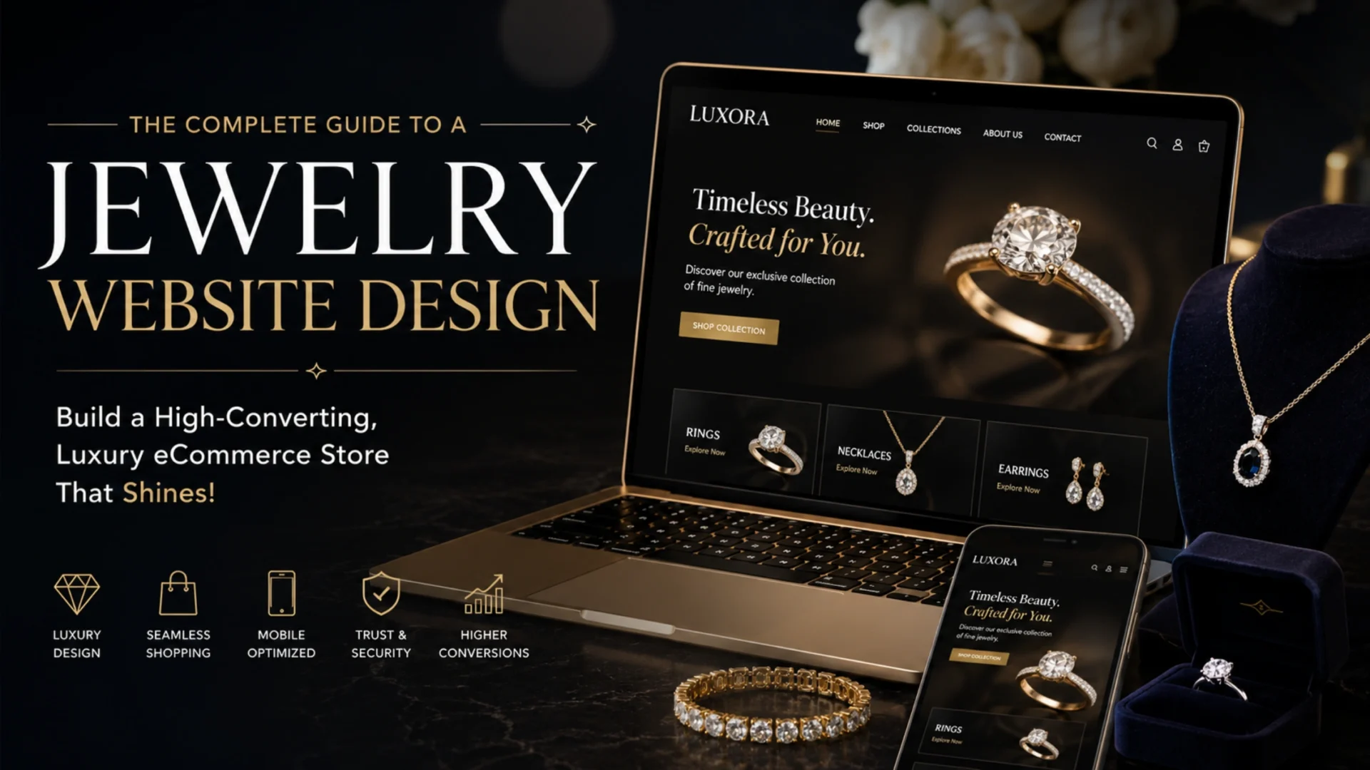
- What makes jewelry website design different from fashion or general ecommerce
- The psychology of buying luxury jewelry online
- How shoppers actually browse expensive jewelry
- Decision anxiety and how design reduces it
- Self-gifting versus buying for someone else
- Core visual design and photography that actually converts
- Mobile UX and navigation architecture for a large jewelry catalog
- Product pages, diamond filtering, and the trust framework that actually works
- Choosing the right platform: Shopify Plus vs Magento vs BigCommerce vs headless
- Conversion rate optimization strategies built for jewelry
- SEO, AI personalization, and the trends actually worth your attention
- Performance, accessibility, and security: the parts nobody photographs
- A realistic build roadmap and what it costs
- Common mistakes that quietly kill jewelry ecommerce conversions
- How Elsner approaches jewelry website design and development
- Quick reference checklist
- Ready to build a jewelry website that actually converts?
- Frequently Asked Questions
- What is the best platform for a jewelry ecommerce website?
- How much does it cost to build a jewelry website?
- How long does it take to design and launch a jewelry ecommerce site?
- Is Shopify good enough for a luxury jewelry brand?
- What features should a jewelry website have?
- How do you build trust on a jewelry ecommerce website?
- Do jewelry websites need diamond search filters?
- How does AI personalization work for jewelry ecommerce?
- What is the average conversion rate for jewelry ecommerce websites?
- Should a jewelry website offer financing options?
- Is buying fine jewelry online safe?
- What is the difference between headless commerce and traditional ecommerce for jewelry?
- Do jewelry websites need to be ADA or WCAG accessible?
- Can a jewelry website support both retail and wholesale customers?
A jewelry brand owner in Chicago once told me her new site looked exactly like her mood board. Every pixel matched the Pinterest inspiration. Six months post-launch, conversion sat under 0.6 percent, well below what a fine jewelry store should see. The site was not ugly. It was undirected. Gorgeous photography with no zoom depth, a mega menu built for a 3,000-SKU catalog she didn’t have, and a checkout that asked for account creation before it asked for a credit card.
That gap between “looks good” and “sells well” is the entire subject of this guide. Jewelry is one of the few categories where beautiful design can still lose the sale, because the thing being sold is expensive, emotional, and impossible to touch through a screen. This guide covers what actually moves conversion on a jewelry ecommerce site: design principles, platform choice, trust architecture, and the technical details most guides skip entirely. Read it the way you’d read a pre-launch audit, because that’s exactly how it’s structured.
Quick Answer
Good jewelry website design makes an expensive, emotional purchase feel safe. That means true-to-life photography with real zoom depth, visible certification and return policy near the price, a checkout that doesn’t add surprise costs late, and a platform that can handle real-time pricing on diamonds and customizable pieces without collapsing under SKU complexity. Beauty gets the click. These four things get the sale.
What makes jewelry website design different from fashion or general ecommerce
Treating a jewelry site like a fashion site is the most common mistake I see in audits, and it usually happens because the same agency or template built both. A $40 t-shirt and a $4,000 engagement ring are both “products” in a cart, but the psychology behind buying them has almost nothing in common.
Fashion ecommerce runs on impulse and frequency. Someone buys five shirts a year without a second thought. Jewelry runs on hesitation and rarity. A shopper might buy one meaningful piece every few years, and they’ll research it the way they’d research a car purchase, across multiple sessions, multiple brands, and often a conversation with someone else before they commit.
| Factor | Jewelry | Fashion | Electronics |
|---|---|---|---|
| Average order value | High, often $150 to $10,000+ | Low to medium, $30 to $200 | Medium to high, $100 to $2,000 |
| Purchase frequency | Rare, once every 1 to 5 years per category | Frequent, seasonal | Moderate, tied to product lifecycle |
| Research time | Days to weeks, multiple sessions | Minutes, often one session | Hours to a few days |
| Primary conversion blocker | Trust and authenticity doubt | Fit and style uncertainty | Feature comparison overload |
This table should change how you brief a designer. If your jewelry site runs on the same conversion logic as a fashion store, countdown timers, aggressive upsells, constant urgency banners, you’re optimizing for the wrong psychology. Jewelry shoppers don’t need to be rushed. They need to be reassured, and reassurance takes a different kind of design entirely.
The psychology of buying luxury jewelry online
Most jewelry sites optimize for the wrong moment. They chase the click, not the fifth visit. And that’s the real issue, because jewelry is rarely a one-session purchase.
How shoppers actually browse expensive jewelry
In practice, a jewelry shopper’s journey looks less like a funnel and more like a loop. They find a piece, leave, come back days later on a different device, open two competitor tabs to compare, ask a partner or friend what they think, and only then commit. If your analytics only track last-click attribution, you’re missing most of the decision-making that actually happened.
This has a direct design implication. Your site needs to support re-entry well. That means a wishlist that persists across devices, an email capture that doesn’t feel pushy on visit one, and product pages detailed enough to answer the questions a shopper still has on visit three, without forcing them into a live chat every time.
Decision anxiety and how design reduces it
Anxiety in a luxury purchase rarely shows up as a bounce. It shows up as an open tab that never gets acted on. Good design reduces this directly: visible certification, a generous and clearly stated return window, and photography detailed enough to answer the questions a shopper would ask in person. Bad design tries to paper over the anxiety with urgency tactics, which usually backfires on a luxury brand.
Self-gifting versus buying for someone else
These are two different journeys wearing the same catalog. A self-gifting shopper wants speed and a treat-yourself framing. Someone buying an engagement ring or a milestone gift wants guidance and reassurance, often through a completely different navigation path built around occasion rather than product type. Very few jewelry sites separate these two paths, and it’s a real missed opportunity for both conversion and average order value.
Core visual design and photography that actually converts
“Use high-quality images” is advice that sounds correct and helps nobody execute anything. Here’s what it actually requires.
Luxury design leans on restraint. Generous whitespace around each product, a limited color palette, and a refined typeface for headings all signal craftsmanship before a shopper reads a single word. Cramped layouts with busy backgrounds undercut even genuinely beautiful jewelry.
Photography is where most jewelry sites quietly lose sales, and it deserves more than a bullet point.
Photography checklist
- Angles: at least four per piece, straight-on, three-quarter, top-down, and a macro detail shot of the setting or clasp. Rings need a side profile showing band thickness, a common source of return requests.
- Zoom level: support 400 to 500 percent zoom without pixelation. Shoppers zoom in specifically to check for inclusions or color, and a blurry zoom kills trust instantly.
- Background: true white or neutral gray for the primary image, since that’s what shoppers compare across brands. Save lifestyle backgrounds for secondary images.
- Lighting: diffused, even lighting is non-negotiable for metal and stone work. Harsh direct light blows out highlights on polished gold and misrepresents the actual finish.
- Lifestyle versus studio: lead with studio shots, follow with lifestyle. A shopper wants an accurate product view before a mood shot.
- File format and compression: serve WebP with a JPEG fallback, keep individual images under 200KB without visible quality loss, and lazy-load anything below the fold.
- Video: a 5 to 10 second rotation or 360-degree spin adds real conversion lift on higher-priced pieces, since it’s the closest digital equivalent to picking the piece up in a store.
Skip one of these and the site survives. Skip several at once and a $3,000 ring starts looking like a $300 one on screen, which is a design failure with a direct revenue cost.
Mobile UX and navigation architecture for a large jewelry catalog
Most jewelry research happens on mobile. Most jewelry purchases, especially above a certain price point, still finish on desktop. That gap is real, and it means the two experiences need different priorities rather than one responsive layout doing double duty.
On mobile, prioritize thumb-zone placement for zoom triggers and add-to-cart, keep filters collapsible, and simplify any engraving or personalization field to as few taps as possible. On desktop, you can afford a richer configurator, side-by-side comparisons, and financing options placed prominently, since desktop sessions tend to represent the shopper who’s ready to commit.
Navigation decisions come down to catalog size, and getting this wrong is one of the more fixable problems I see in audits.
| Catalog size | Recommended navigation | Why |
|---|---|---|
| Under 200 SKUs | Simple top-level menu by product type | Mega menus add friction without adding value at this scale |
| 200 to 1,000 SKUs | Mega menu with product type and occasion categories | Supports both browsing shoppers and gift shoppers |
| 1,000+ SKUs or B2B/B2C hybrid | Mega menu plus faceted filtering plus dedicated diamond search | Necessary to prevent decision fatigue at scale |
Breadcrumbs matter more here than in most categories, because shoppers jump backward mid-session to compare constantly, and losing their place in a large catalog is a fast way to lose the sale entirely.
Product pages, diamond filtering, and the trust framework that actually works
The product detail page is where trust either gets confirmed or lost. At minimum it needs high-zoom imagery, a rotation video, certification displayed prominently rather than buried in a tab, sizing guidance specific to the product type, and social proof placed near the add-to-cart button rather than at the bottom of the page.
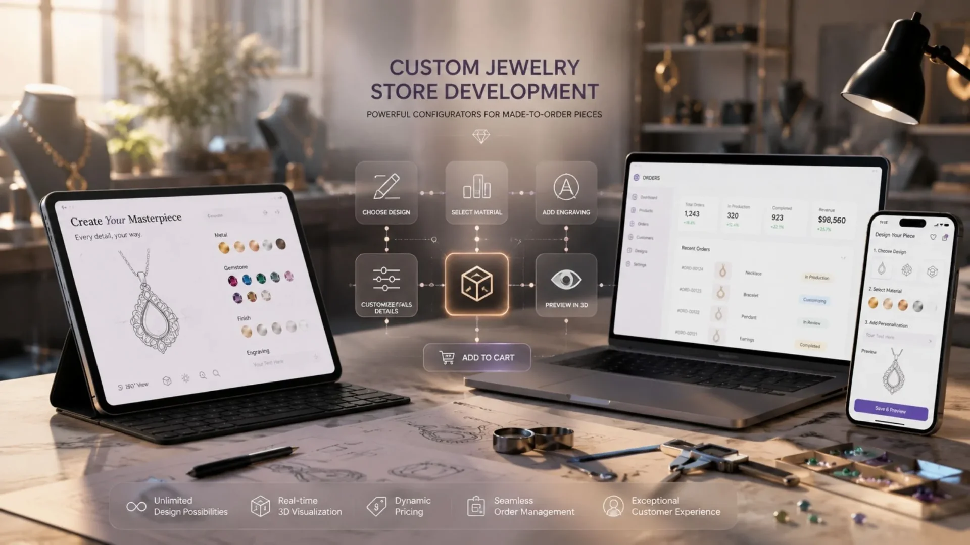
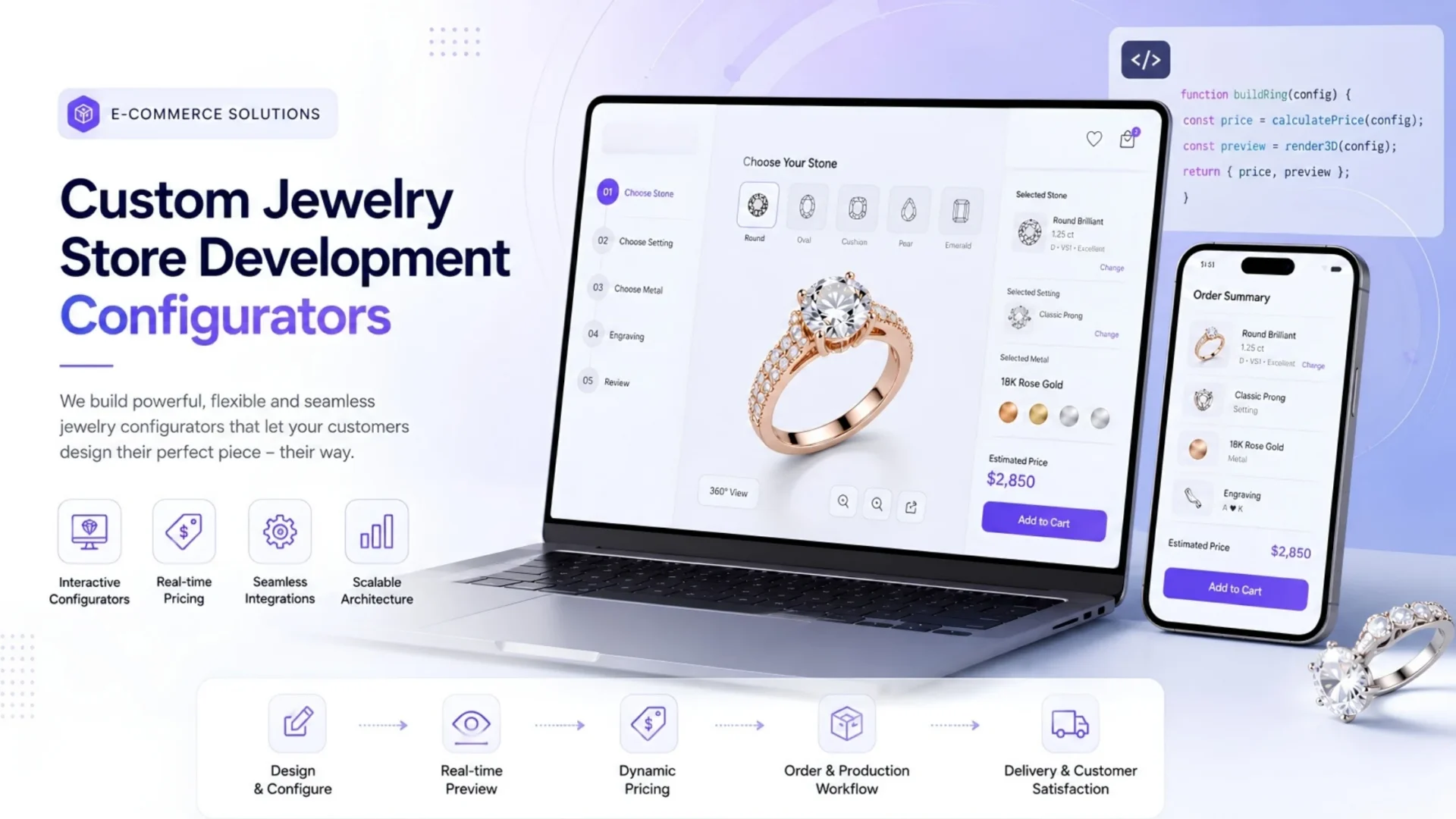
Configurators, where a shopper chooses metal, stone, and engraving in one flow, work well when they show a live price update at every step. They work poorly when the total only appears at the end, which is exactly the kind of checkout surprise that Baymard Institute’s research repeatedly identifies as one of the leading reasons shoppers abandon a cart when unexpected costs appear late.
If you sell loose diamonds or build-your-own pieces, filtering by the 4Cs needs to be progressive, not a wall of dropdowns dropped on the shopper at once. Show carat and price first, since those drive the initial decision, then let clarity and color refine from there. Behind the scenes, real-time pricing feeds from suppliers mean prices and availability need to update automatically as market rates shift, which is a genuine technical undertaking and a common reason jewelry projects go over budget when the platform wasn’t chosen with this in mind.
Trust signals don’t work as a scattered list of badges either. They work as a placement strategy tied to where a shopper’s doubt actually shows up.
| Trust signal | Where it belongs | Why |
|---|---|---|
| Certification (GIA, IGI, blockchain) | On the PDP, near the price | Addresses authenticity doubt at the decision point |
| Reviews with photos | On the PDP, above the fold | Confirms the product matches expectations |
| Return policy summary | Near add-to-cart, again at checkout | Reduces perceived risk of a wrong purchase |
| Security badges | At checkout, near payment fields | Addresses card-data trust at the final step |
| Real company information | Footer and About page | Builds baseline legitimacy for a high-ticket purchase |
The mistake most sites make is loading trust signals into a footer or a dedicated “Why Buy From Us” page that almost nobody visits. Trust has to live at the point of doubt, not in a separate section shoppers have to go looking for. This is also where a considered approach to building trust in jewelry ecommerce pays off far more than a generic badge strip.
Choosing the right platform: Shopify Plus vs Magento vs BigCommerce vs headless
This is the section every jewelry brand owner actually needs, and it’s the one most guides get wrong by staying neutral. Neutral doesn’t help you make a decision.
| Platform | Best for | Starting cost (USD) | Timeline | Watch-out |
|---|---|---|---|---|
| Shopify Plus | Growing D2C brands under $10M revenue, catalog under a few thousand SKUs | $6,500 to $15,000 | 8 to 14 weeks | App fatigue if relying on too many third-party plugins for configurators and diamond search |
| Magento / Adobe Commerce | Complex catalogs, B2B/B2C hybrid models, deep customization needs | $15,000 to $50,000+ | 12 to 20 weeks | Higher ongoing maintenance, needs a dedicated dev resource |
| BigCommerce | Mid-market brands wanting flexibility without Magento’s overhead | $8,000 to $20,000 | 10 to 16 weeks | Smaller app ecosystem for jewelry-specific tools like diamond search integrations |
| Headless commerce | Enterprise retailers needing custom front-ends and multiple storefronts | $25,000 to $60,000+ | 16 to 24 weeks | Often a poor investment for brands under $5M in revenue |
Here’s my honest take after building on most of these. If you’re under $500,000 in annual revenue and considering headless because it sounds impressive, don’t. You’ll spend enterprise money solving a problem you don’t have yet. Shopify Plus with the right theme and a handful of well-chosen apps will outperform a headless build at that stage, every time. Headless earns its cost when you genuinely need multiple storefronts, complex personalization, or a front-end experience your platform’s native theme system can’t support. Weighing this properly is exactly where ecommerce development services built around your actual catalog complexity, not a generic template, make the difference.
Conversion rate optimization strategies built for jewelry
Cart abandonment is a real number worth knowing before you assume your site is underperforming. Across ecommerce broadly, Baymard Institute’s aggregated research puts the average cart abandonment rate around 70 percent, and unexpected costs revealed late in checkout are consistently one of the biggest drivers of that number. Jewelry checkouts often make this worse by adding late-stage engraving fees, insurance add-ons, or financing steps that weren’t visible earlier in the flow.
The fix isn’t more urgency. It’s showing the full price, including any customization cost, as early as possible, and keeping the checkout itself as short as the product complexity allows. Baymard’s checkout usability research suggests the average site carries dozens of fixable friction points, and jewelry sites tend to accumulate more of them than most categories because of the extra steps involved in customization and financing.
On urgency specifically: countdown timers and “only 2 left” messaging work fine for fast fashion. On a luxury jewelry site, they read as cheap and can undermine the premium positioning you’ve spent the rest of the site building. If you want urgency, tie it to something real, a limited collection drop, a seasonal collaboration, not manufactured scarcity on evergreen inventory. This is one area where a partner focused on conversion rate optimization can test what actually works for a luxury audience instead of importing tactics from mass-market retail.
Buy Now Pay Later options like Affirm or Klarna deserve a specific mention here, since financing genuinely reduces hesitation on high-ticket purchases. Place the option on the PDP itself, not buried at checkout, so a shopper can see the monthly breakdown before they’ve committed mentally to the full price.
SEO, AI personalization, and the trends actually worth your attention
Product, Merchant Listing, FAQ, and Breadcrumb schema all matter, but the technical issue most jewelry sites get wrong is faceted navigation. Filtering by metal, stone, size, and price can generate thousands of URL variations if canonical tags aren’t handled correctly, creating duplicate content problems and wasting crawl budget on large catalogs. This is a bigger issue in jewelry than in most verticals precisely because the filtering options are so extensive, and it’s a detail most generic ecommerce SEO guides skip entirely.
Building topical authority matters more after recent core updates than it used to. A single strong page on jewelry website design does less for your domain than that same page sitting inside a cluster of related content, buying guides, care guides, gifting guides, all interlinked and clearly part of the same topic. Our own jewelry digital transformation guide is a useful companion piece if you’re planning that cluster.
Not every AI feature vendors are selling right now is worth the investment, and it’s worth saying that plainly instead of listing every feature as equally valuable. Genuinely useful right now: recommendation engines trained on browsing and purchase history, size and fit prediction for rings and bracelets, and AI-assisted customer service that answers certification and sizing questions instantly. Still overhyped for most brands: generic AR try-on tools that don’t accurately render metal reflectivity or stone sparkle. A poorly rendered AR overlay can do more harm than good, since it sets an expectation the physical product then has to live up to.
The trends worth watching in 2026 connect directly back to everything above rather than existing as a separate list: transparency messaging around sourcing and lab-grown versus natural stones, blockchain-based certificates of authenticity for high-value pieces, and video-driven storytelling replacing static hero banners. None of these work in isolation. They only add value once the fundamentals in this guide are already in place.
Performance, accessibility, and security: the parts nobody photographs
Google now scores Core Web Vitals holistically rather than as isolated metrics, so a jewelry site passing LCP but failing INP or CLS no longer gets full credit. For a site carrying dozens of high-resolution images and videos per page, compression and lazy-loading become a ranking issue, not just a UX nicety. Serve responsive image sizes based on device, defer non-critical scripts, and audit your PDP templates specifically, since that’s where most of the heavy media lives.
WCAG 2.2 compliance isn’t optional for US ecommerce brands given the current legal exposure around accessibility lawsuits. Alt text on every product image, keyboard-navigable filters, and sufficient color contrast on price and CTA text are the baseline. This is a section almost every competitor guide skips, and it’s a real gap given how many US retailers have faced legal action over inaccessible sites in recent years.
PCI DSS compliance is table stakes for any site processing card payments, but jewelry specifically benefits from visible fraud detection messaging given the average transaction size. Offer the payment methods shoppers actually expect, major cards, PayPal, and a BNPL option, since each missing option is a small reason to abandon that adds up across a large catalog.
A realistic build roadmap and what it costs
Trying to launch every feature in this guide at once is how jewelry ecommerce projects blow past their budget and timeline. The projects that go smoothly sequence the work.
1
Foundation: platform, photography, catalog structure
Pick the platform based on real catalog size and revenue stage, not ambition. Shoot photography to the standard covered earlier. Structure product data cleanly before any filtering or configurator logic gets built on top of it.
2
Trust and checkout architecture
Place certification, reviews, and return policy at the points of doubt mapped out earlier. Build the checkout to show full pricing early, with financing options visible on the PDP rather than buried at the last step.
3
Configurators and diamond search
Add live-pricing configurators and diamond filtering once the foundation is stable. This is the phase most likely to run over budget if the real-time pricing feed wasn’t scoped properly at the platform stage.
4
SEO, performance, and AI layers
Handle faceted navigation SEO, tune Core Web Vitals, and layer in the AI features that have actually earned their place, recommendations and size prediction first, AR try-on only if the budget supports real quality.
| Project tier | Typical cost (USD) | Typical timeline |
|---|---|---|
| Basic Shopify build | $6,500 to $15,000 | 8 to 12 weeks |
| Mid-market custom build | $15,000 to $35,000 | 12 to 18 weeks |
| Enterprise or headless build | $35,000 to $60,000+ | 16 to 24 weeks |
These ranges assume standard scope. Diamond search integrations, custom configurators, and CRM or ERP synchronization all add cost, typically $2,000 to $6,000 per major integration depending on complexity.
Common mistakes that quietly kill jewelry ecommerce conversions
Some of these show up constantly during audits, often on sites that look polished at first glance.
Using only lifestyle photography without a clean studio shot looks nice, but shoppers can’t actually evaluate the product from it. Hiding the return policy behind a footer link means the doubt has already done its damage by the time a shopper finds it. Treating mobile as an afterthought loses shoppers before they ever reach the device where they’d convert, given how much research happens there first. Overusing urgency tactics on a luxury brand rarely drives the intended action and often just cheapens the perception of the brand. And skipping faceted navigation SEO work quietly bleeds organic traffic on a large catalog, the kind of loss that nobody notices until a rankings audit turns it up.
How Elsner approaches jewelry website design and development
We’ve worked directly on jewelry ecommerce projects including Dian Jewellery and Glamourgems, and the pattern across nearly every jewelry engagement is the same. Clients come in expecting a design problem and often leave having also solved a platform, catalog, or trust-signal problem they hadn’t fully diagnosed on their own. That’s usually where the real conversion gains come from, not just a visual refresh.
If you’re evaluating your current jewelry site, or planning a new one, we’d rather start with an honest audit than a pitch. If your catalog is already complex, that conversation is worth having before you commit to a platform.
Quick reference checklist
- Match design psychology to jewelry’s slow, multi-session buying pattern, not fashion’s impulse pattern
- Shoot photography with real zoom depth, correct lighting, and studio shots leading over lifestyle
- Support persistent wishlists and gift-friendly navigation for buyers shopping for someone else
- Place trust signals at the point of doubt: certification near price, reviews on the PDP, returns near checkout
- Choose a platform based on real revenue stage and catalog complexity, not what sounds most advanced
- Show full pricing, including customization costs, before checkout to avoid late-stage surprises
- Fix faceted navigation SEO before your filtered catalog generates duplicate content at scale
- Confirm WCAG 2.2 and PCI DSS compliance before launch, not after a complaint
Ready to build a jewelry website that actually converts?
Talk to a team that has designed, audited, and built jewelry ecommerce sites end to end, from photography standards and trust architecture to platform choice and configurator logic.
Frequently Asked Questions
What is the best platform for a jewelry ecommerce website?
Shopify Plus works well for most growing D2C jewelry brands under $10M in revenue. Larger catalogs, B2B and B2C hybrids, or brands needing deep customization typically outgrow Shopify and move to Magento or a headless setup.
How much does it cost to build a jewelry website?
Costs typically range from $6,500 for a basic Shopify build to $60,000 or more for an enterprise headless solution, depending on catalog complexity and required integrations like diamond search or configurators.
How long does it take to design and launch a jewelry ecommerce site?
Most projects take 8 to 24 weeks depending on platform choice, catalog size, and how many custom features like configurators or diamond search are required.
Is Shopify good enough for a luxury jewelry brand?
Yes, for most brands under $10M in annual revenue. Shopify Plus handles high-resolution imagery, financing integrations, and most configurator needs well through its app ecosystem.
What features should a jewelry website have?
High-zoom photography, rotation video, visible certification, a transparent return policy, secure checkout with financing options, and mobile-optimized navigation are the baseline requirements.
How do you build trust on a jewelry ecommerce website?
Place trust signals at the point of doubt rather than in a separate section. Certification near the price, reviews on the product page, and return policy near the add-to-cart button all work better than a generic trust badge footer.
Do jewelry websites need diamond search filters?
Yes, if you sell loose diamonds or build-your-own pieces. Progressive filtering by carat and price first, then clarity and color, prevents decision fatigue on large stone inventories.
How does AI personalization work for jewelry ecommerce?
The most effective current uses are recommendation engines and size or fit prediction. Generic AR try-on tools are still inconsistent in quality and often not worth the investment yet for most brands.
What is the average conversion rate for jewelry ecommerce websites?
It varies by brand and price point, but jewelry generally converts lower than fashion due to longer research cycles and higher average order values. Reducing checkout friction tends to move this number more reliably than traffic growth alone.
Should a jewelry website offer financing options?
Yes. Buy Now Pay Later options like Affirm or Klarna reduce hesitation significantly on high-ticket purchases and should be visible on the product page, not just buried at checkout.
Is buying fine jewelry online safe?
It can be, provided the site displays clear certification, uses PCI DSS compliant payment processing, and offers a transparent, generous return policy. These are the signals a shopper should look for before purchasing.
What is the difference between headless commerce and traditional ecommerce for jewelry?
Headless separates the front-end experience from the back-end platform, allowing more custom design freedom. It’s usually only worth the added cost for enterprise brands needing multiple storefronts or highly custom experiences.
Do jewelry websites need to be ADA or WCAG accessible?
Yes. WCAG 2.2 compliance reduces legal exposure and improves usability for all shoppers. This includes alt text, keyboard navigation, and sufficient color contrast throughout the site.
Can a jewelry website support both retail and wholesale customers?
Yes, though it typically requires a platform with tiered pricing capability and a separate wholesale portal, more common on Magento or a customized Shopify Plus setup than a basic ecommerce build.