
- What is Flexbox?
- Why Invest in Flexbox?
- What are the Main Features of Flexbox?
- What are the Advantages of Flexbox?
- What are the Disadvantages of Flexbox?
- What are the Unique Flexbox Properties?
- Parent Class Flex Properties –
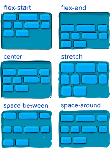
- Align-items
- Align-Content
- Justify-content
- Flex-direction
- Flex-flow
- Flex-wrap
- gap, row-gap, column-gap
- Child Class Flex Properties
- Order
- Align-self
- Flex-grow
- Flex-basis
You’ll discover that there are several options for rearranging items on a web page. Over time, new techniques have emerged, and outdated practices have become obsolete. Flexbox is a relatively recent method of CSS element manipulation, and its introduction was ground-breaking.
Due to the fact that it is a relatively new technology, many sites place it towards the conclusion of their curriculum. However, many developers now use it as the default method of placing items. Why not study Flexbox first as it will likely be one of your toolbox’s most often utilized items?
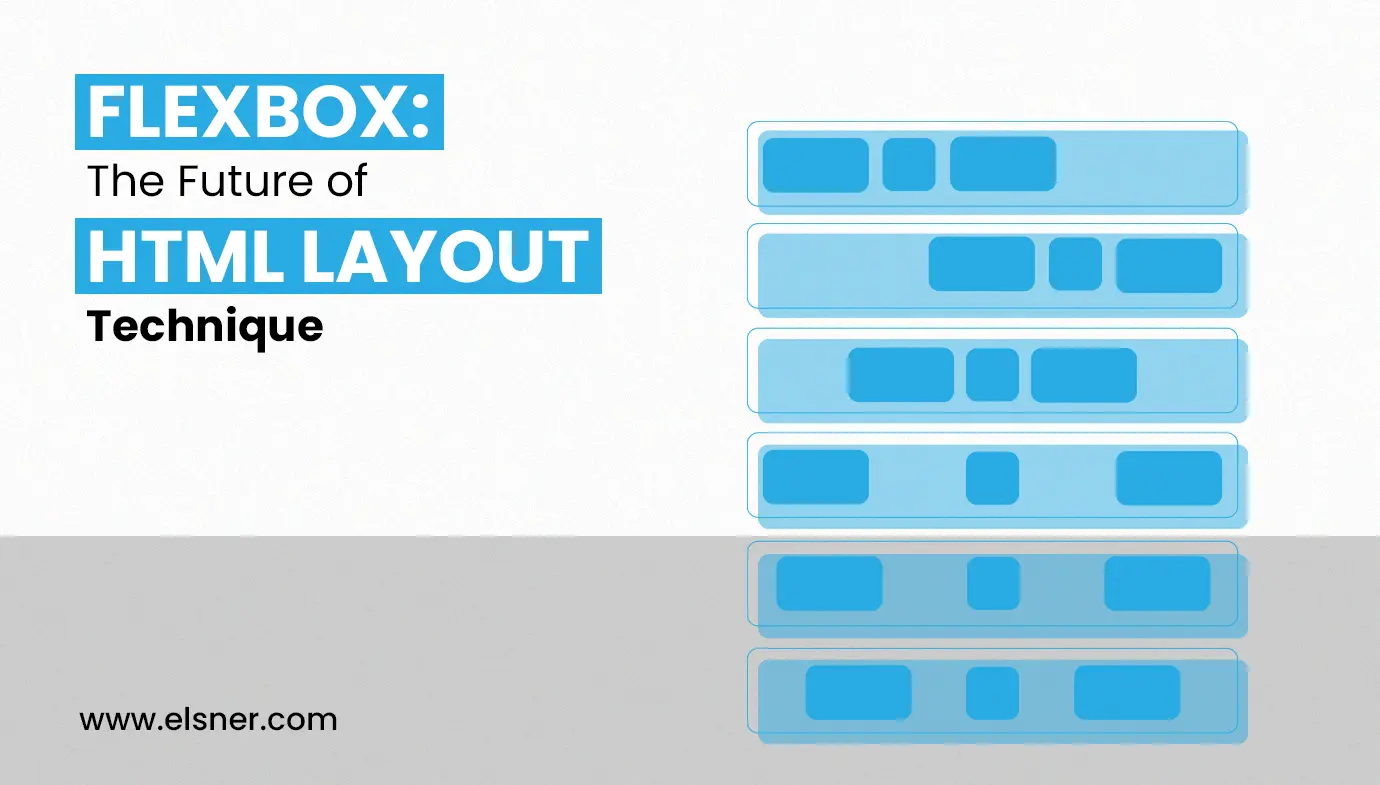
Items may be arranged into rows or columns using flexbox. Based on certain straightforward principles that you may describe, these things will flex (i.e., expand or shrink). Let’s look at a straightforward demonstration to get things going. In these classes, there are several interactive examples incorporated.
What is Flexbox?
The flex layout enabled the container to adjust its items’ width/height to maximize space utilization by adjusting its items’ width/height. A flexible handle grows objects to fill free space or shrinks them to prevent flooding. Most importantly, the flexbox format is orientation agnostic because it is limited to standard formats (vertical-based body and horizontal inline). While they work well on pages, they need adaptability to scale with large or complex applications, especially when it comes to changing presentation, resizing, adding, etc.
Why Invest in Flexbox?
- They are single lines by default, but you can ask for them to wrap into several lines.
- Layout components can be arranged differently from the DOMs.
- The distribution of space allows the objects to change in size according to the volume of their parent.
- These Flexbox alignment settings can add space around the elements and flex lines in a wrapped layout. All the Elements can be oriented on the cross-axis.
What are the Main Features of Flexbox?
- Flexbox is a one-dimensional format module designed for efficient arrangement and space dispersion in interfaces giving you a responsive web design.
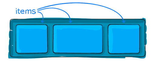
- Applying a display type of flexbox to the parent container will cause all of its child components to change into the flex sort; these are referred to as “flex items.”
- Flexbox is a CSS display type that may help us create CSS formats quickly and easily.
- We may format the website’s content using the Flexbox demonstration. Not at all, it matters that we provide the frameworks necessary to create responsive websites for a variety of devices.
What are the Advantages of Flexbox?
- Flex format simplifies responsive web page planning and construction without relying on CSS properties, allowing for efficient space allocation and adjustment across devices and screen sizes.
- We will improve any component without modifying the HTML code.
- Flexbox similarly distributes height and width for the object, so even while things are included robustly, there is no need to worry about CSS properties.
What are the Disadvantages of Flexbox?
- Flexbox has execution or Performance issues. By this, we mean that page loading time for complex projects increases. Comparing flexbox-based and non-flexbox pages can be challenging.
- Complex lattices can be extremely difficult to remember, especially for beginners.
- Flexbox may be simple, but more advanced flexbox forms can quickly become complex. Investigating complicated formats is also quite chaotic.
What are the Unique Flexbox Properties?
Parent Class Flex Properties –
- Container

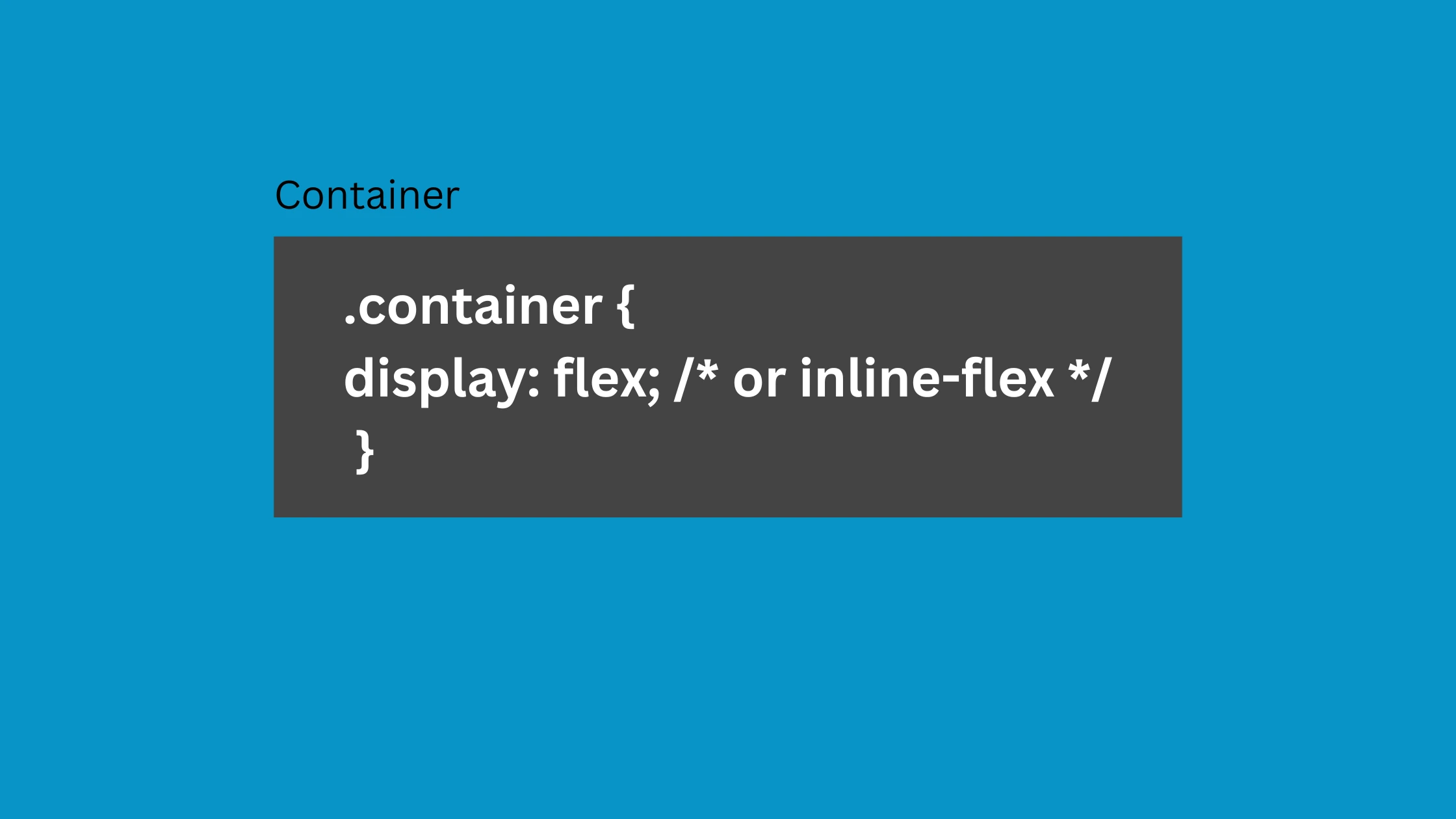 Display:
Depending on the value specified, this specifies a flex container that can be either inline or block. It provides all of its direct children with a flexible context.
Align-items
This property specifies how flex elements are arranged along the cross-axis on the current line by default. Consider it the justify-content feature’s cross-axis counterpart.
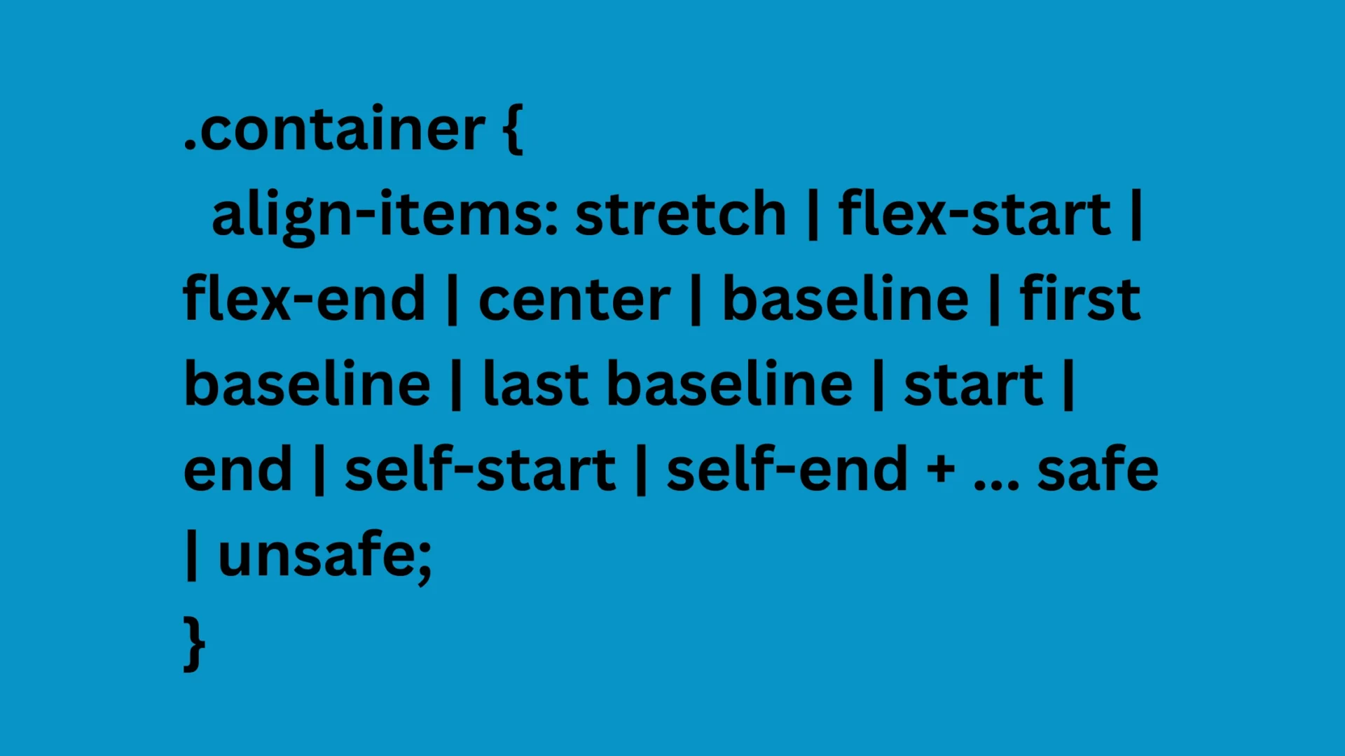
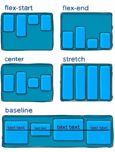
- stretch (default): Fill the container with stretch, respecting min-width/max-width.
- flex-start / start / self-start: Items are positioned at cross-axis starting, affecting flex-direction and writing-mode rules.
- flex-end / end / self-end: Items arranged cross-axis, following flex-direction and writing-mode rules.
- center: Items centered on the cross-axis.
- baseline: Aligned items with baselines.
Align-Content
Flex container lines align with extra space in the cross-axis, similar to justify-content.
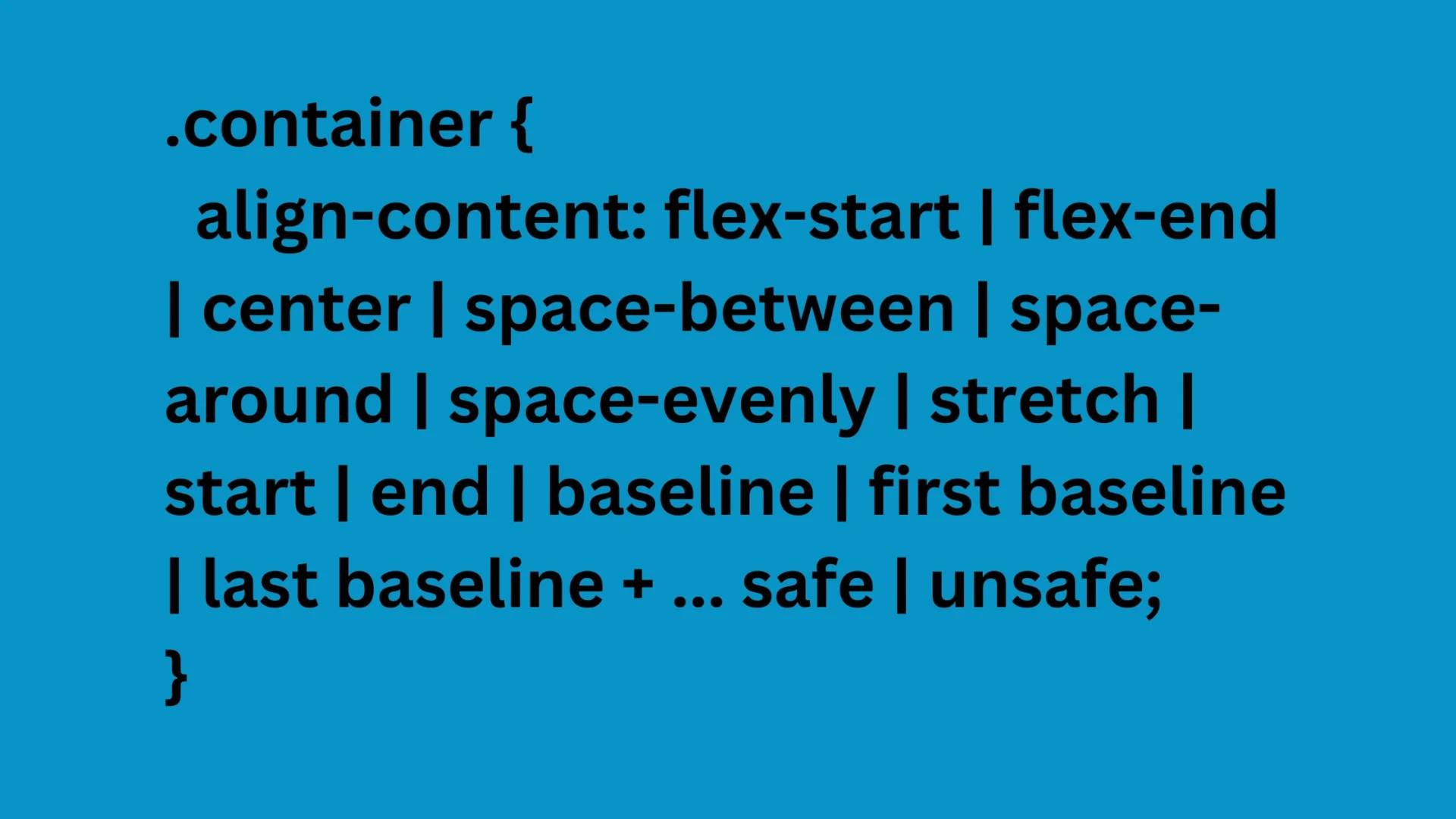
- normal (default): Items packed in default position without set value.
- flex-start / start: Container items packed to start, flex-start honors flex-direction, start honors writing-mode direction.
- flex-end / end: Pack items at the end of the container, flex-end supports flex-direction.
- Cente r: Container contains items centered.
- Space-between: Container with evenly distributed items starting at the beginning.
- Space-around: items equally distributed with equal space around each line
- Space-evenly: Items distributed evenly with similar areas.
- Stretch: Stretching lines take up the leftover area.
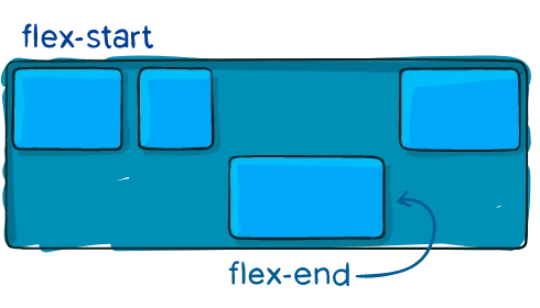
Justify-content
The central axis of the alignment distributes extra space when flex items are inflexible or reach maximum size and controls overflow when things overflow the line.
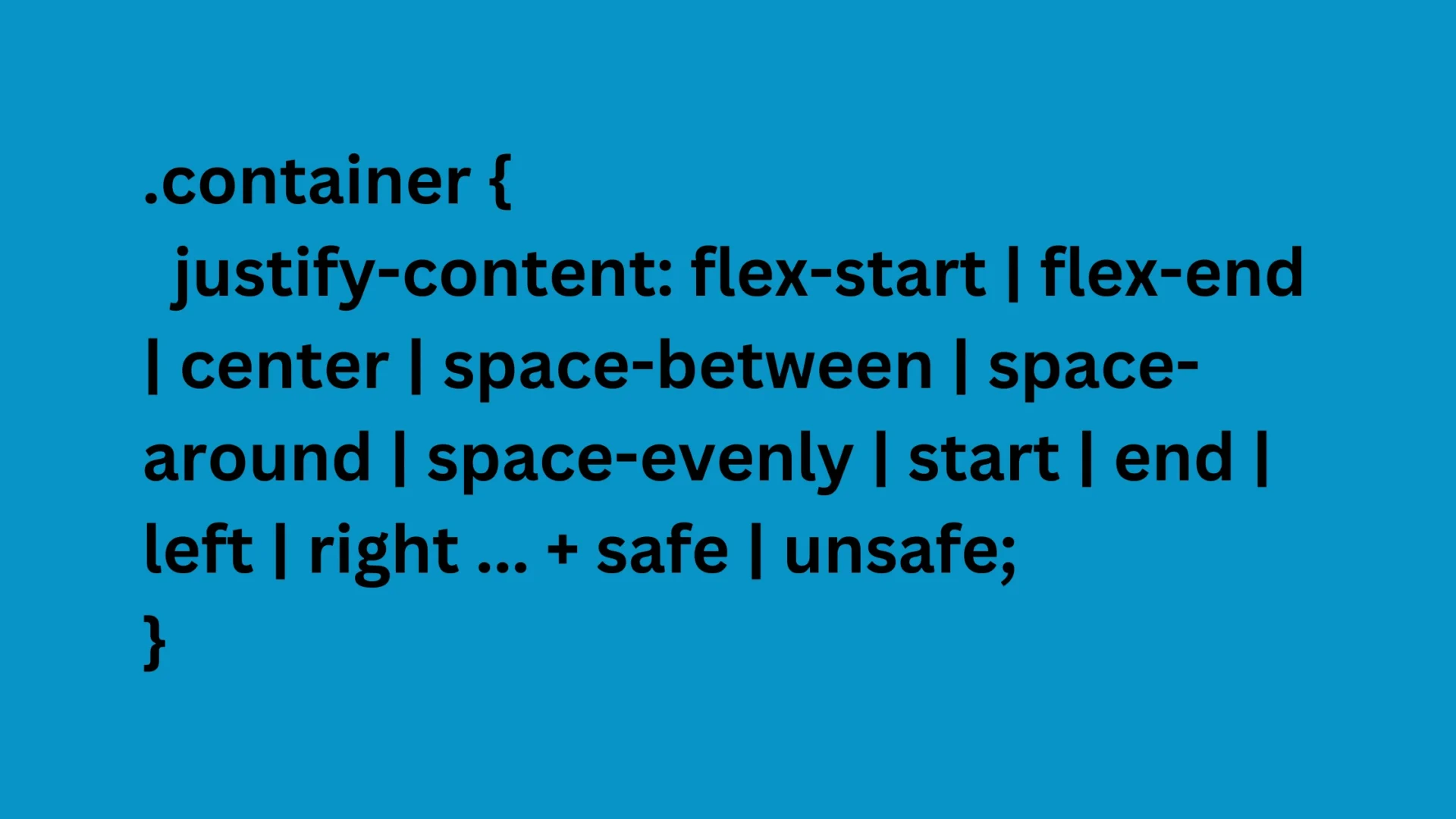
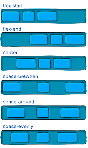
- flex-start: Pack items at flex-direction start.
- Flex-end: Items packed at the flex-direction end.Start: Pack items at the beginning of the writing-mode direction.
- End: Packing items towards the writing-mode direction end.
- Left: Items packed towards the container’s left edge unless flex-direction doesn’t make sense.
- Right: Items packed towards the container’s right edge unless flex-direction contradicts.
- Centre: Items centered along a line.
- Space-between: Line items are evenly distributed, starting at the end.
- Space-around: Items are constantly delivered aligned, accompanying equal space, but visibly they forbiddance equal. The first part is an individual scope against the bottle edge, while the following item has allure.
- Space-evenly: Items are distributed with equal spacing between items and edges.
Flex-direction
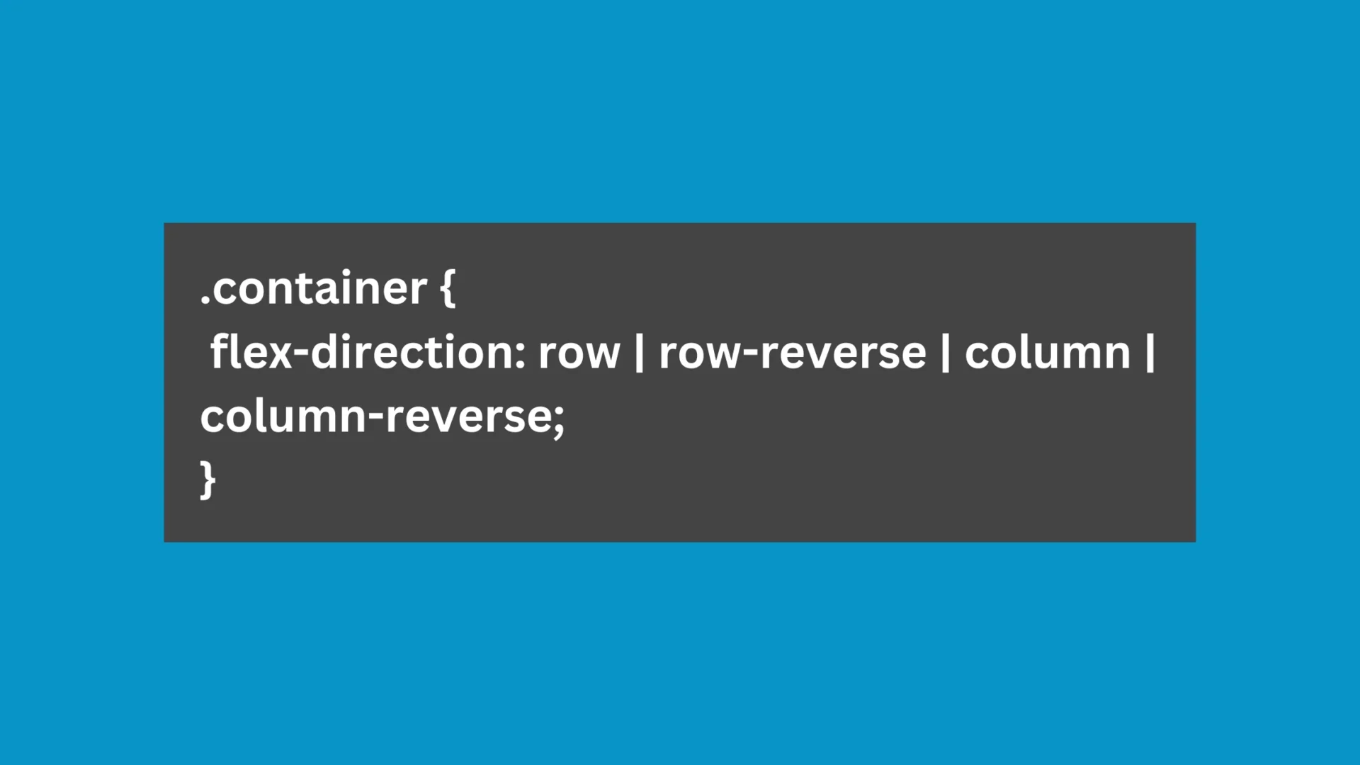
Flexbox is a single-direction layout concept, defining the direction flex items are placed in flex containers, either horizontally or vertically.
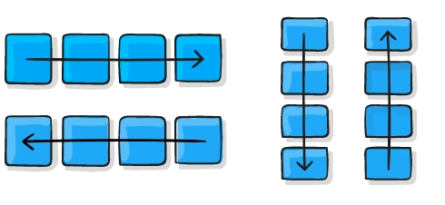
- Row: Flex-direction arranges rows in the same text direction as the default
value. - Row-reverse: Property reverses flex items in text direction, ensuring reversed order.
- Column: Row arrangement in column top to bottom, indicating regular top-to-bottom direction.
- Column-reverse: Row-reverse column arrangement for average bottom-to-top direction in items.
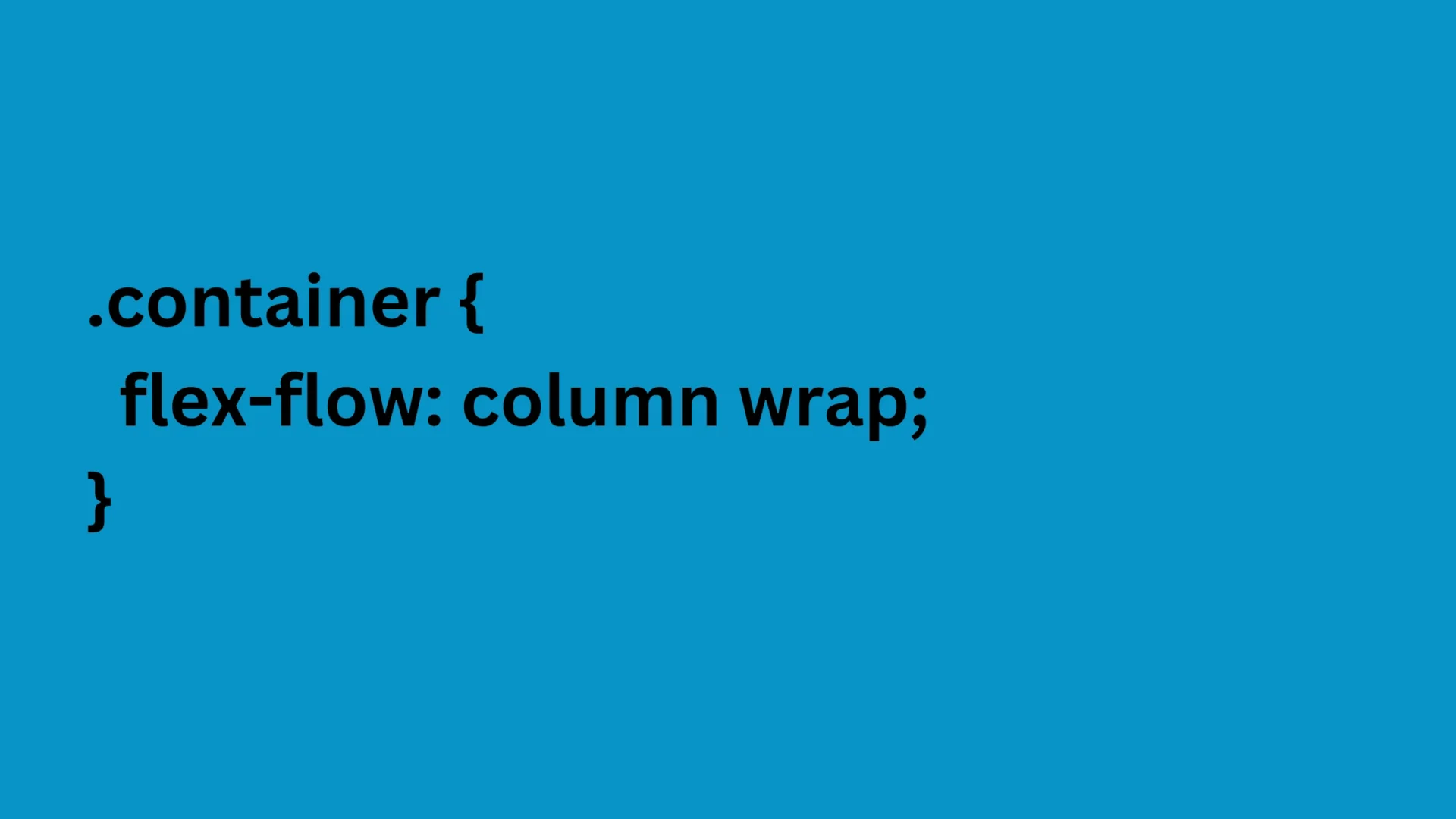
Flex-flow
Flex-direction and wrap properties define the flex container’s main and cross axes, default row nowrap.
Flex-wrap
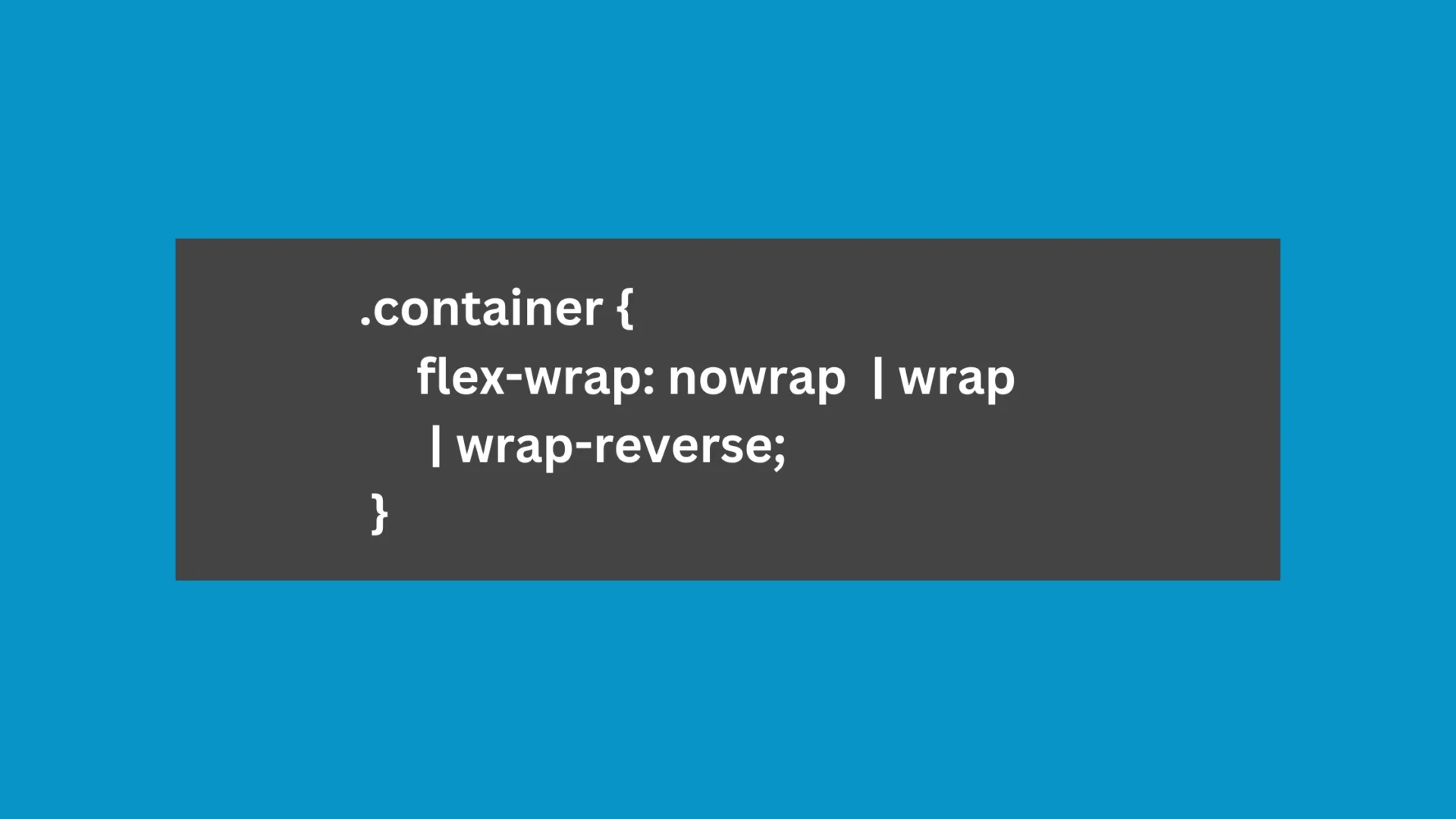
Flex items default fit onto one line; adjust with property for wrapping.
- Nowrap: All flex items will be listed on one line.
- Wrap: Flex items wrap across multiple lines vertically.
- Wrap-reverse: Flex items wrap across multiple lines horizontally.
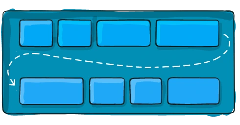
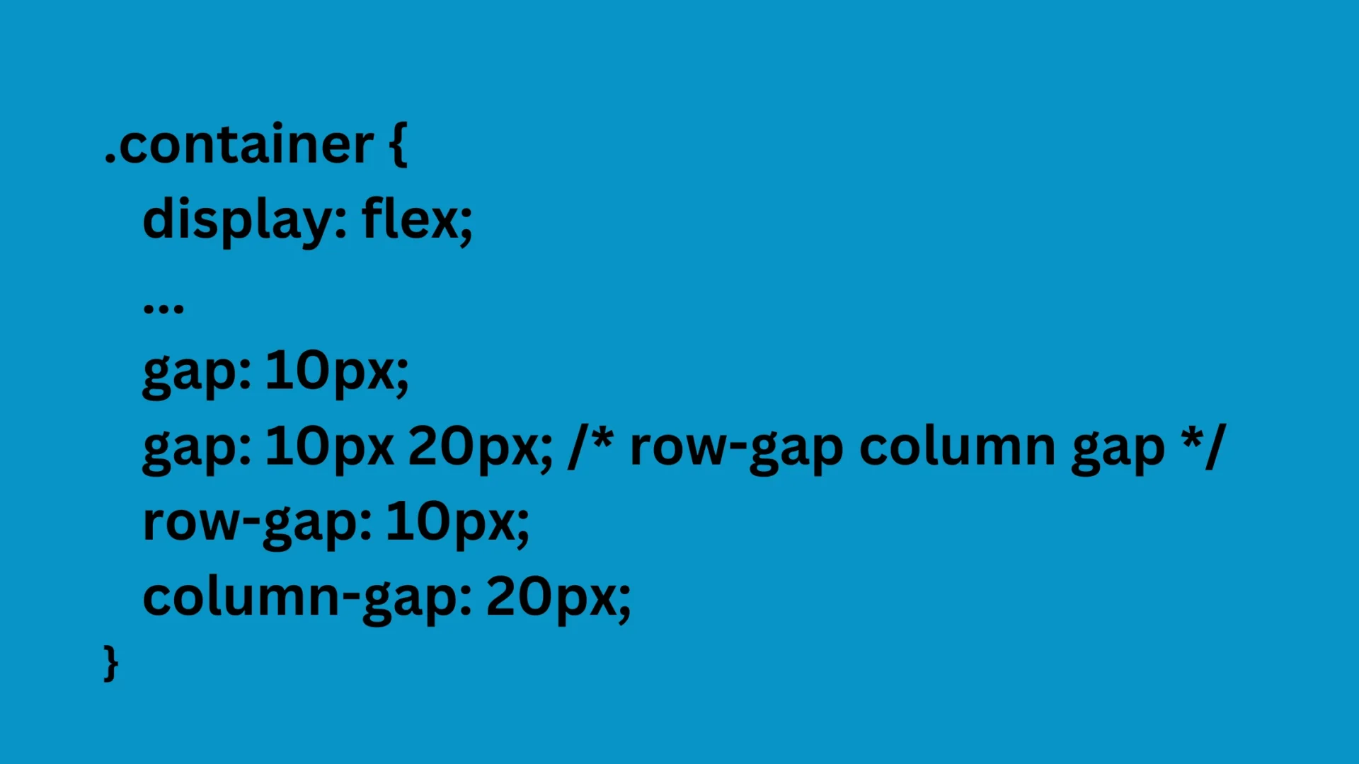
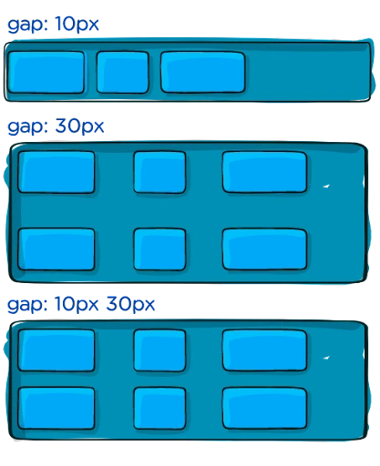
gap, row-gap, column-gap
Crevice property controls space between flex objects, dividing them as if not on edges. The behavior of the least canal is when the canal is larger, causing the hole to impact the space further. This behaviour applies to both framework and multi-column formats.
Child Class Flex Properties
Order
Flex components are often arranged in the source order by default. However, the order property determines the order in which they appear in the flex container.
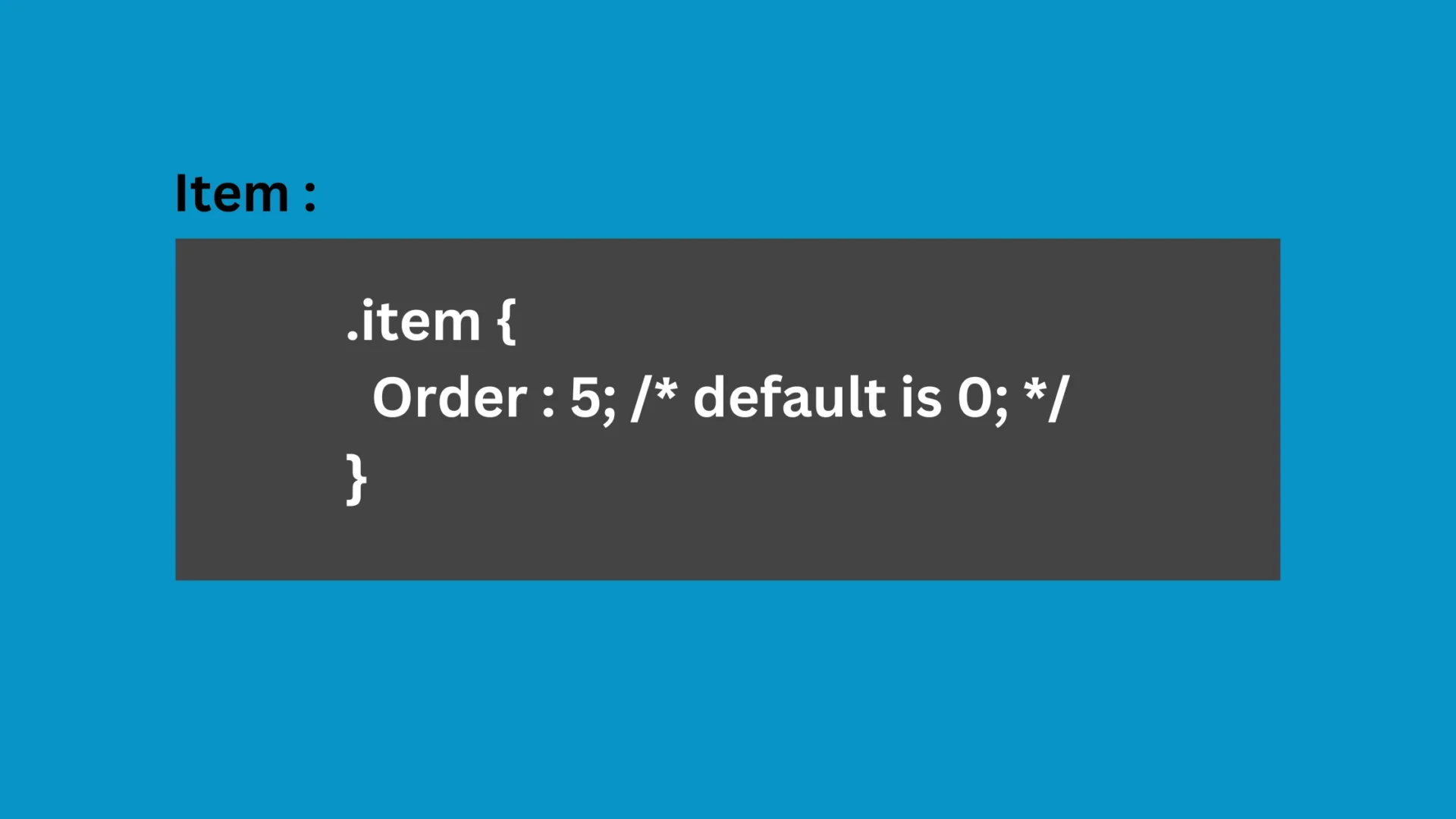
Order :
Flex items are typically arranged in source order, but the order property controls their appearance.
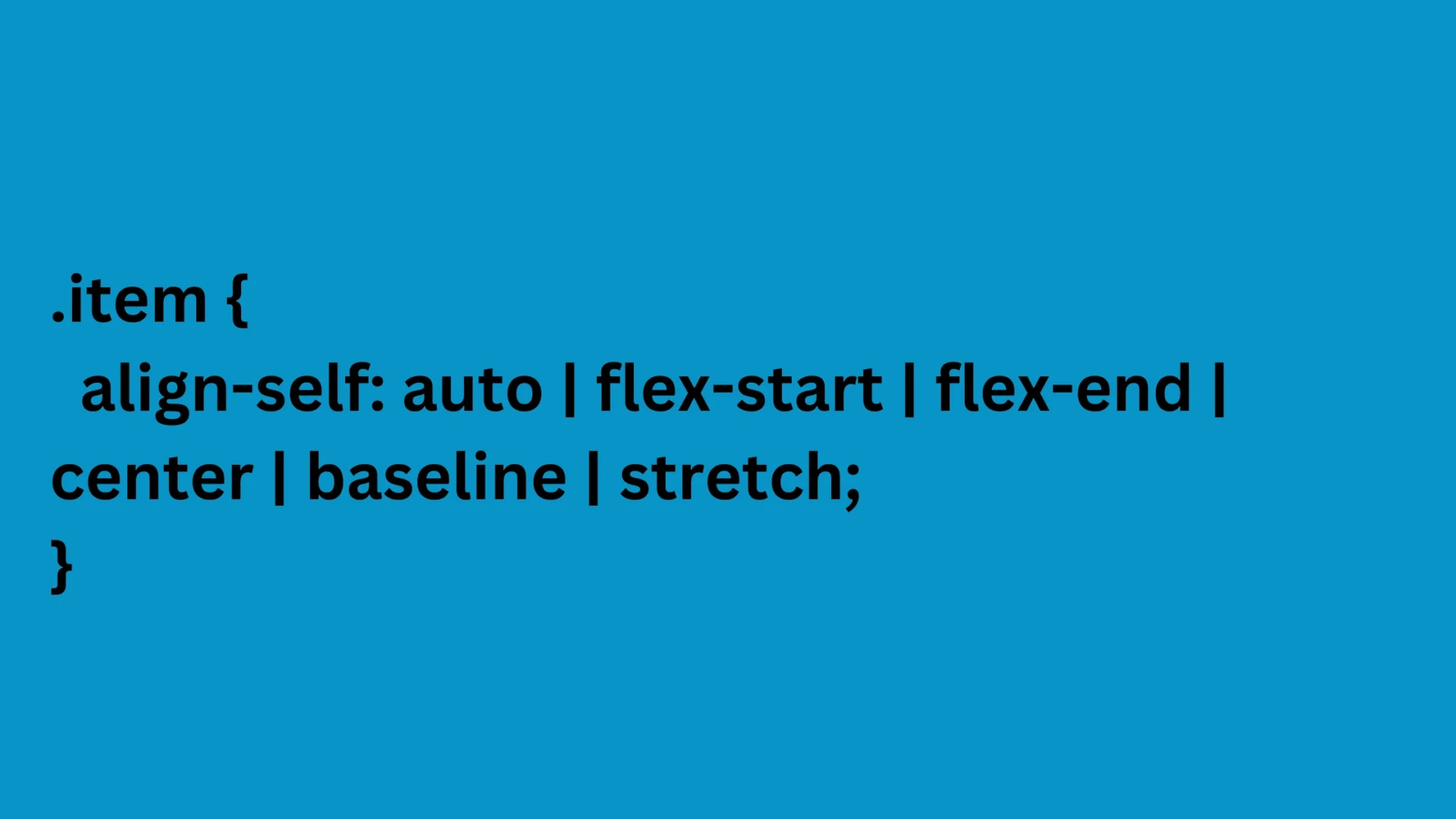
Align-self
Modify flex item alignment by overriding the default.
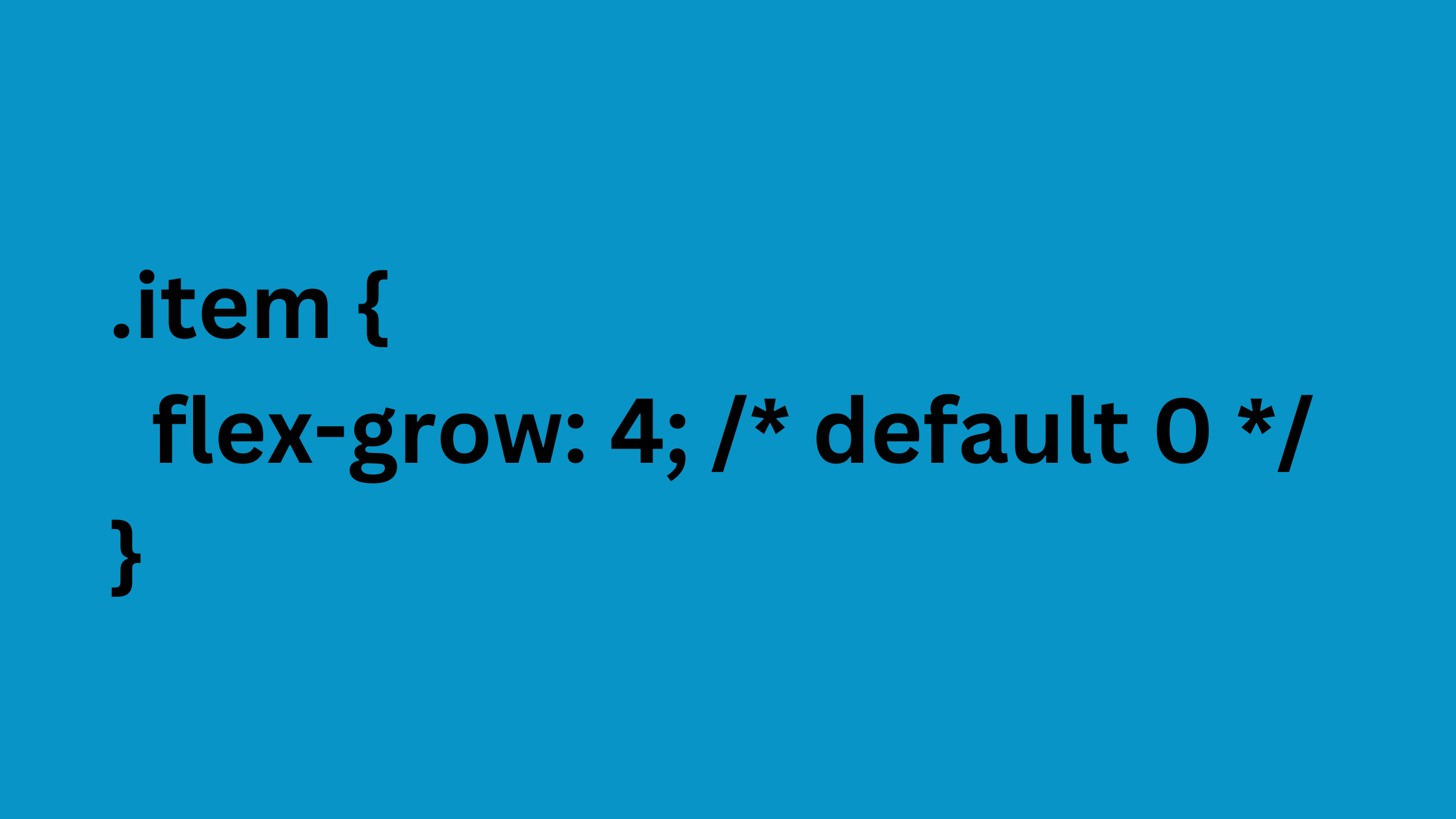
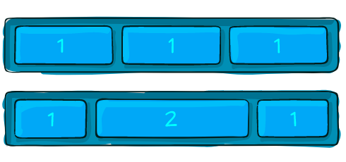
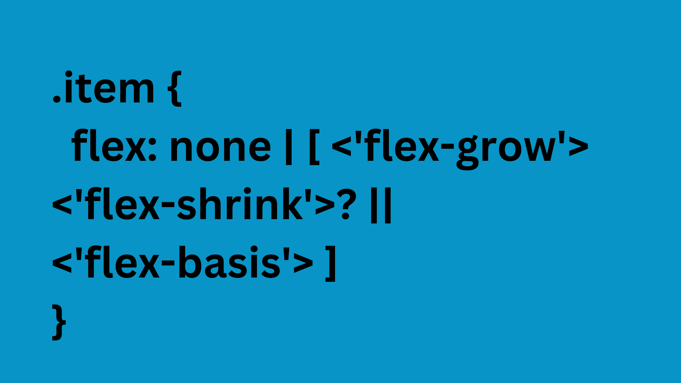
Flex-grow
Flex-grow is a unitless measure that manages the available space in a flex holder. It acknowledges a unitless value and distributes the remaining space equally among all children. If one child has a 2 value, it takes up twice as much space as the others.
Flex-basis
Invalid weak numbers are often used in printing on paper for bend-develop, bend-decrease, and flex-support parameters. The default is 1 car, but setting a range with a flex value can change it.
Summing it up!
Flexbox might be a great addition to your business with its unique features and functionalities. Frameworks function at the format level and are container-based, whereas Flexbox is content-based and modifies the substance.
You can always reach us, we have experienced developers to handle all your requirements at ease.
