





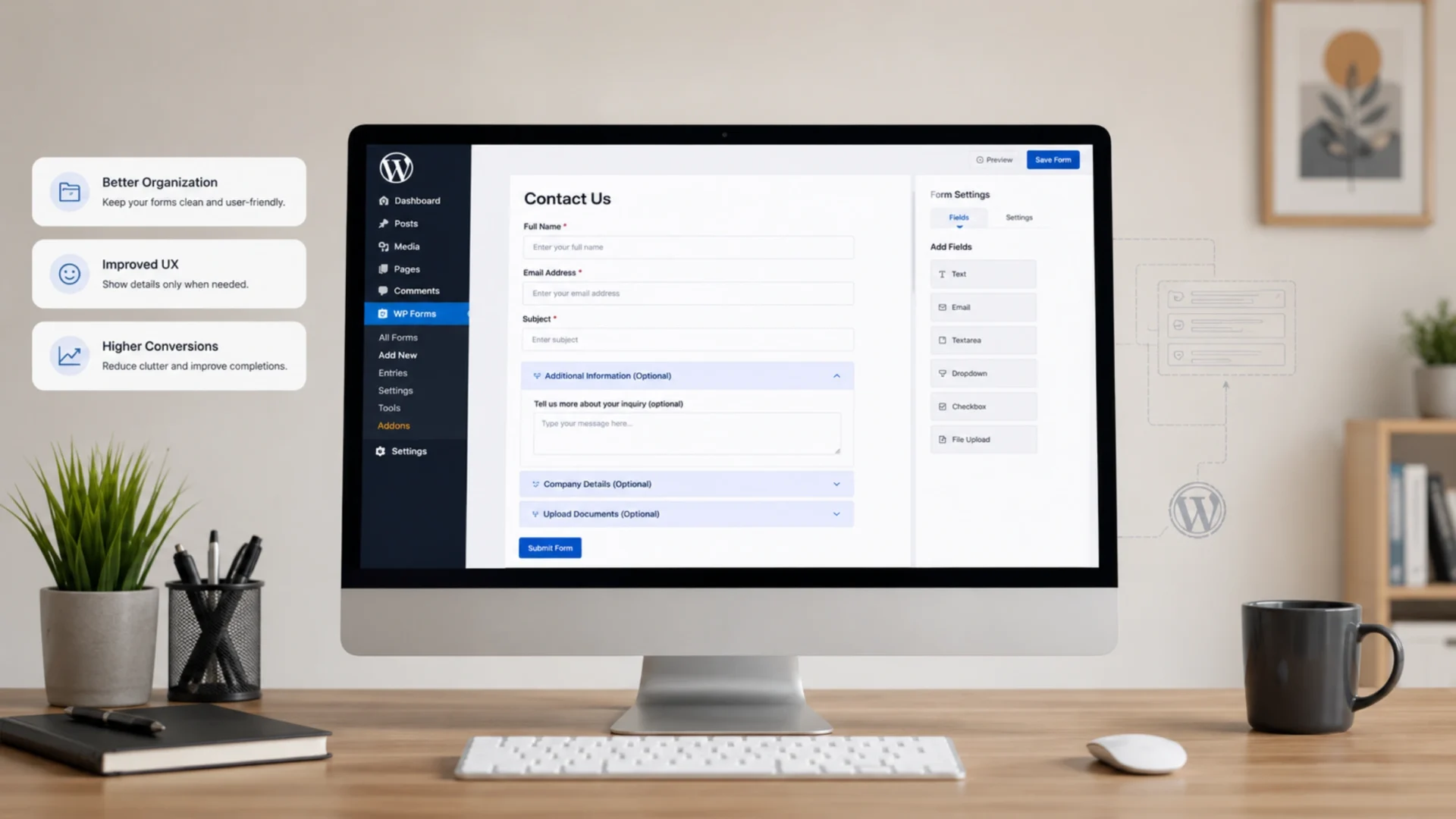
- What Is a Collapsible Section in a WordPress Form
- When Collapsible Sections Actually Help (And When They Don’t)
- Method 1: Fluent Forms Native Accordion
- Method 2: Formidable Forms Collapsible Section Field
- Method 3: WPForms Workaround Routes
- Method 4: Gravity Forms With a Small Snippet
- Method 5: The No Plugin HTML Approach
- UX Rules That Make Collapsible Forms Actually Convert
- Accessibility — The Part Nobody Talks About
- Common Mistakes That Quietly Hurt Conversions
- Collapsible vs Multi Step Forms
- What Google’s 2026 Updates Mean for Form Heavy Pages
- Quick Implementation Checklist
- Putting It All Together
- Frequently Asked Questions
You’ve spent weeks fine tuning a WordPress form. The fields are sharp. The labels are clear. And the completion rate still sits at 14 percent. So what’s actually going wrong?
Usually, it isn’t the fields. It’s the length. A long form looks intimidating before a visitor reads the first label. The brain registers “too much work” in under two seconds, and the back button wins.
Collapsible info inside WordPress forms is one of the simplest fixes for that. Group related fields under expandable sections, hide the optional stuff by default, and suddenly the same form feels half as long. This guide walks through every reliable way to add collapsible sections to a WordPress form, the UX rules that decide whether it works, and what Google’s 2026 ranking updates mean for form heavy pages. If you’d rather hand the whole thing off, our WordPress development team builds form systems like this every week, but the steps below work fine for in house teams too.
What Is a Collapsible Section in a WordPress Form
A collapsible section is a group of form fields tucked behind a clickable header. Users see the section title. They click. Fields slide open. They fill them in. Simple.
It’s also called an accordion section in some plugins. The technical name behind the behavior is progressive disclosure, which is a UX principle that says: show people only what they need to see right now. Everything else stays one click away.
Three patterns get confused often:
- Collapsible (accordion): sections expand and collapse vertically on click
- Tabs: sections switch horizontally, only one visible at a time
- Multi step: sections appear on separate pages with next and back buttons
All three reduce perceived form length. Collapsible is the lightest touch and the easiest to add. That’s usually where you start.
When Collapsible Sections Actually Help (And When They Don’t)
This is the part most tutorials skip. They show you the how without telling you the when.
Collapsible works well for:
- Job application forms with separate sections for personal, work, and reference details
- Intake forms where some fields apply only to certain user types
- RFQ or quote request forms with optional add ons
- Long event registration forms with attendee info, dietary preferences, and merchandise
- Healthcare or legal intake forms where each section needs its own context
Skip it for short contact forms. If your form has fewer than six fields, collapsible sections add friction instead of removing it. Visitors have to click before they can even start typing. That’s the opposite of what you want.
Skip it for checkout flows too. Multi step works better there because the user expects a sequence: cart, shipping, payment, confirm. Hiding the payment fields behind a collapsed accordion feels broken.
Honestly, the rule I follow: if you can’t write a clear name for each section in under five words, the form isn’t ready for accordion treatment. Reorganize first.
Method 1: Fluent Forms Native Accordion
Fluent Forms makes this almost embarrassingly easy. Their Section Break field has accordion behavior built right in.
Steps:
- Open your form in the editor
- Drag a
Section Breakfield where you want the accordion to start - In the field settings, toggle the section type to
Accordion - Add an icon and a header title
- Drop the fields that should sit inside that section beneath it
- Repeat for each new collapsible block
The Pro version unlocks tab style alongside accordion, plus conditional logic that can auto open a section based on a previous answer. Useful for forms that branch.
Watch out for: the default styling looks plain. Spend ten minutes in the styler tab to match your brand colors. A generic accordion looks like a placeholder and visitors notice.
Method 2: Formidable Forms Collapsible Section Field
Formidable takes a similar approach. Their Section field sits in the layout group of the form builder, and the collapsible toggle is one checkbox away.
Add a Section field, click into its settings, scroll to Display Options, and check Collapsible. Choose whether it starts open or closed by default. Save the form.
Formidable’s Lite version supports this, which makes it the cheapest entry point if you’re starting from zero. The Pro upgrade adds conditional logic for showing or hiding sections based on previous answers.
One quirk: Formidable lets you nest a section inside another section. Don’t. Nested accordions confuse users and look like a bug. Keep the hierarchy flat.
Method 3: WPForms Workaround Routes
Here’s the honest part. WPForms doesn’t have a native collapsible section field the way Fluent and Formidable do. If you’re already paying for WPForms, you’ve got two real options.
Option A: use the Page Break field for a multi step form. It isn’t accordion behavior, but it solves the same problem of perceived form length. Visitors only see one section at a time, with next and back navigation.
Option B: drop in an HTML field and write your own accordion markup using the native <details> and <summary> tags. Style it with custom CSS. This works, but the fields inside still submit through WPForms normally, so nothing breaks on the backend.
If accordion behavior is non negotiable for your project, Fluent or Formidable wins on cost and setup time. WPForms is excellent at a lot of things. This isn’t one of them.
Method 4: Gravity Forms With a Small Snippet
Gravity Forms ships with a Section Break field, but the field doesn’t collapse on its own. You need a little JavaScript to make it behave like an accordion.
Add a Section Break field for each block. Give each one a CSS class like collapsible-section in the field’s advanced settings. Then add this snippet to your theme’s custom JS or a code snippets plugin:
document.querySelectorAll('.collapsible-section').forEach(s => { s.style.cursor='pointer'; s.addEventListener('click', () => s.classList.toggle('open')); });
Then add CSS that hides the fields below each section by default and shows them when the parent has the open class. About fifteen lines of CSS total.
More work than Fluent or Formidable. But Gravity Forms shops usually have a developer on call anyway. If you don’t, you can hire WordPress developers for short engagements like this one. It’s typically a fifteen minute job for someone who’s done it before.
Method 5: The No Plugin HTML Approach
If you don’t want to pay for a Pro plan and you’re comfortable with the block editor, native HTML handles this without a single plugin add on.
The <details> and <summary> elements are built into every modern browser. They give you an accordion for free.
In the block editor, add a Custom HTML block above your form and paste:
<details><summary>Optional Information</summary><p>Helper text or form notes go here.</p></details>
For form fields themselves, wrap them with the same pattern using the form plugin’s HTML field. Add a few lines of CSS to remove the default browser triangle and replace it with a chevron icon. Done.
This approach won’t give you the polish of a paid plugin. But for a side project or a quick test, it’s free and works on every browser, including mobile Safari.
UX Rules That Make Collapsible Forms Actually Convert
Adding the accordion is the easy half. The hard half is making sure it actually helps people finish the form instead of confusing them. This is where most teams need real conversion rate optimization thinking, not just plugin settings.
A few rules I’ve watched work across hundreds of real forms:
- Section headers should describe what’s inside. “Personal Details” beats “Section 1”. Be specific.
- Show a field count next to each header. “Contact Info (4 fields)” tells visitors what they’re in for. Reduces drop offs.
- Never collapse a section with required fields by default. Users miss them and get submission errors. Errors kill trust faster than long forms.
- Pick one expand icon and stick with it. Plus and minus, or chevron up and down. Not both. Not on the same form.
- Keep the animation under 300 milliseconds. Anything slower feels sluggish, especially on mobile.
- Save partial input. If a user accidentally collapses a half filled section, the data should still be there when they reopen it. Most plugins do this by default. Test it anyway.
One pattern that backfires: auto collapsing a section after the user finishes filling it. Feels clever in theory. Confuses users in practice because they lose the ability to review what they entered. Leave completed sections open.
Accessibility — The Part Nobody Talks About
Most form tutorials never mention this. They should. A form that screen readers can’t navigate is a form that fails ADA compliance, and that’s a legal risk in plenty of jurisdictions.
If you’re building the accordion yourself, your section headers need ARIA attributes:
aria-expandedset to true or false depending on statearia-controlspointing to the ID of the content panelrole="button"on the header element so screen readers announce it correctly
Keyboard users need Tab to focus the header and Enter or Space to toggle it. A visible focus ring is non negotiable. Strip it out for aesthetics and you’ve broken your form for thousands of people who navigate without a mouse.
Fluent Forms and Formidable handle most of this automatically. Custom builds need testing. Run NVDA or VoiceOver across your form before you call it done. Five minutes that saves you a lawsuit.
Common Mistakes That Quietly Hurt Conversions
A short list of traps that show up over and over on client audits. Most of these overlap with broader UX mistakes that kill conversions, but a few are specific to collapsible forms:
- Burying the submit button inside a collapsed section. Visitors hit the bottom of the form, see no button, and bounce. Always keep submit visible.
- Using vague headers like “More Info” or “Additional Details”. Specific labels convert better.
- Forgetting to test on mobile Safari. iOS handles the
<details>element slightly differently and your styling can break in ways desktop never reveals. - Not tracking which sections users actually open. Without GA4 event tracking on the toggle, you have no data to optimize. Add it from day one.
- Stacking three or more accordion sections deep. Long forms with too many collapsed blocks feel hidden. Visitors stop trusting that they’ve seen everything.
If your form fails on any of these and your conversion rate is suffering, fix the obvious ones before testing fancier optimizations.
Collapsible vs Multi Step Forms
Both reduce perceived form length. They solve the problem differently. Picking the wrong one wastes implementation time and can make completion rates worse, not better.
| Feature | Collapsible Sections | Multi Step Forms |
|---|---|---|
| Best for | Optional or grouped fields | Sequential decision flows |
| Mobile UX | Good if executed cleanly | Generally better |
| Average completion lift | 10 to 20 percent | 15 to 30 percent |
| Implementation effort | Low | Medium |
| Risk of user confusion | Higher if labels are vague | Lower |
| Form analytics depth | Needs custom event tracking | Step level data built in |
If your form has clearly separable sections and most fields are required, multi step usually wins. If your form has a mix of required and optional content, collapsible wins. If you genuinely can’t decide, run an A/B test for two weeks. The data answers faster than any guide.
What Google’s 2026 Updates Mean for Form Heavy Pages
This is the part most form tutorials still aren’t catching up to. Google’s 2026 ranking signals have shifted in three ways that directly affect form design.
Interaction to Next Paint (INP) replaced First Input Delay as a Core Web Vital in March 2024 and is now firmly baked into Google’s page experience signals. Slow accordion animations, heavy form plugins that block the main thread, and clunky JavaScript event handlers all hurt your INP score. A form page with an INP above 200 milliseconds gets ranked lower than one that responds in under 100. Test your forms in PageSpeed Insights and the Chrome User Experience Report before assuming they’re fine.
The Helpful Content System rewards pages that actually solve the visitor’s problem. A form page with no context, no helper text, and a wall of required fields signals low effort. Collapsible sections that include genuine inline guidance score better. Add a short helper paragraph at the top of each accordion explaining what the section is for.
AI Overviews pull structured answers from pages that load fast and have clear semantic markup. Forms with proper labels, fieldset and legend tags, and ARIA attributes have a better chance of getting referenced when someone asks Google how to build a similar form. Skip the markup, and your form page stays invisible to the AI surface entirely.
None of these are dealbreakers. But if you’re building forms in 2026 without thinking about INP, semantic HTML, and helpful content signals, you’re leaving organic traffic on the table.
Quick Implementation Checklist
Save this and run through it before publishing any new form with collapsible sections:
- Pick the plugin or method that matches your form length and budget
- Write specific section headers with field counts
- Keep required fields visible by default
- Test on Chrome, Firefox, and mobile Safari
- Verify keyboard navigation and screen reader output
- Add GA4 event tracking on every section toggle
- Check INP and page speed scores after adding the form
- Run an A/B test against your current form for at least 14 days
- Review drop off data weekly and adjust section labels accordingly
Most teams skip three or four of these and wonder why the new form performs about the same as the old one. Don’t skip.
Putting It All Together
The goal isn’t shorter forms. It’s forms that feel shorter while still collecting everything you actually need. Collapsible sections, done right, are one of the cleanest tools for that. They cost almost nothing to add. They lift completion rates measurably when paired with good UX hygiene. And they keep your form page lean enough to score well on Google’s 2026 page experience signals.
If you’re stuck on a form that converts badly and you’ve already tried shortening it, simplifying labels, and adding social proof, collapsible accordion is the next move worth testing.
Need help auditing your current setup or rebuilding it for real conversion gains? Reach out and tell us where your forms are leaking. We’ll show you what to fix first.
Frequently Asked Questions
What’s the easiest way to add collapsible sections to a WordPress form?
Fluent Forms and Formidable Forms both offer native collapsible section fields with no code required. Drop in a section break, toggle accordion mode, and you’re done in under five minutes.
Do collapsible form sections actually improve conversion rates?
Yes, in most cases. Completion rates lift between 10 and 20 percent on forms with more than eight fields when sections are labeled clearly and required fields stay visible. The gain is smaller on short forms and can even turn negative if you collapse important fields by default.
Are collapsible sections better than multi step forms?
It depends on the form. Multi step works better for sequential flows like checkouts and applications where each section builds on the last. Collapsible works better for grouped optional fields. Pick based on whether your form is linear or modular.
Can I add a collapsible section without a plugin?
Yes. Native HTML <details> and <summary> tags work in the WordPress block editor with light CSS styling. The behavior is built into every modern browser, no JavaScript needed.
Will collapsible sections hurt SEO or Core Web Vitals?
Not if implemented cleanly. Heavy form plugins with slow JavaScript can damage your INP score, which Google now treats as a Core Web Vital. Test with PageSpeed Insights after adding the form and aim for INP under 200 milliseconds.
Do I need ARIA attributes for accessibility?
Yes. Screen readers rely on aria-expanded, aria-controls, and proper role attributes to announce accordion state. Fluent Forms and Formidable handle this automatically. Custom builds need manual ARIA setup or you fail accessibility compliance.
Which plugin should I pick if I’m starting fresh?
Fluent Forms for the best balance of price and features. Formidable for forms that need conditional logic and data heavy workflows. WPForms if you’re already on it and want multi step instead. Skip Gravity unless you have a developer on hand.