
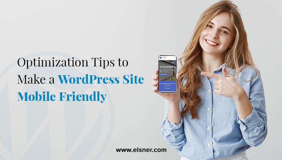
- Why did your WordPress Website Need to be Mobile Responsive?
- 8 Methods to Optimize your WordPress Website for Mobile:
- Test our Website with Online Tools
- Get a Responsive WordPress Theme
- Select a Reliable Web Host
- Improve your Website Loading Time
- Make a Unique Design for Pop-ups
- Make your Website SEO-Friendly
- Use Themes and Plugins
- Track the Progress of the WordPress Website
- Experts Thoughts:
- WordPress Expert 1: JimLiu – seovendor
- WordPress Expert 2: Aleksey Bandurin – DesignRush
- WordPress Expert 3: Micheal Smith – itechhere
Eventually, mobile devices will replace other mediums when it comes to interacting with digital platforms. Does this mean you need to hire WordPress developer to make your website mobile-friendly? Does a mobile-unresponsive affect your business? We understand you do not want a website that does not bring you expected conversion rates and profits.
Why did your WordPress Website Need to be Mobile Responsive?
When you look around, you can see most of the people are having smartphones in their hands. It would be best if you made the website presence on every channel to drive organic traffic. You always have to stay connected with the world of technology to market your business.If your website is not mobile device optimized, it will be difficult for the visitors to reach you. You need to have a website that fits all the screen sizes and resolutions in the best possible way. It will increase the chances of gaining potential customers. You can take help from a
WordPress web design company with experience in the market to ensure your website works smoothly on various devices.
8 Methods to Optimize your WordPress Website for Mobile:
Test our Website with Online Tools
Before you take any action, it is a good move to check your websites for mobile devices. One of the traditional methods is to check on several devices. Access the website and notice its page loading speed and if the design perfectly fits on the smaller screen. After this, you can dive into dedicated testing tools, which are free of cost sometimes.
Get a Responsive WordPress Theme
There are many options available in the market, which can be confusing. The question that comes to mind is, “How to choose a content layout for your WordPress website blog?” This will help you focus on the
WordPress website design, content, and SEO to achieve success. The theme is an important segment for selecting engaging, interactive, and updated themes for your website.
Select a Reliable Web Host
Selecting the best web host for your WordPress website is a crucial decision. The simple fact is if you choose a host or plan that does not provide speed and resources, then it is just a waste of money and time.Your WordPress website performance relies on the web host. You need to select the one that offers high consistency, performance, and minimal downtime. Go with a dedicated web hosting that ensures that it reserved your server for the website, but it increases speed and security.
Improve your Website Loading Time
Website load speed plays a special role in the mobile-first world. Keep your website load speed minimum to make it user-friendly. Optimizing the website helps in decreasing bounce rate and improves the user interaction with the platform. Google also introduced the Speed update, which made website speed a ranking factor for the mobile pages. Some basic methods that can help in improving the speed are:
- Implement caching for the website, which helps in easy access to the website. Many caching plugins help in supporting this feature.
- Use a Content Delivery Network that lets you generate copies of different servers spread across the globe.
- Compress the images and large-size files to reduce the page loading speed.
- Use minimum code to make it more efficiency
- Update your website to avoid any vulnerabilities and security issues.
Make a Unique Design for Pop-ups
They might get a lot of criticism, but they are also an effective way to grab the user’s attention. Simple terms that can help in configuring the pop-ups are:
- They must be non-obstructive. They should cover a small portion of the screen.
- Pop-ups must be easy to close. Users should quickly get access to the close button that is the visible and suitable size.
- Do not apply these to login dialogs, verification forms, or other pop-ups used to display essential information.
Make your Website SEO-Friendly
You should ensure that the online search engine crawlers can easily navigate through your website. Some many plugins and themes can help in improving the SEO of your WordPress website. If you are using pop-ups, ensure that it does not cover the whole mobile screen or hide essential information.
Use Themes and Plugins
WordPress has a magnificent collection of plugins and themes to support the latest features in your website. As a website owner, you need to spend your time and efforts integrating the best plugins in your platform. Some themes can help to deliver a pleasant user experience without much time consumption.
Track the Progress of the WordPress Website
A WordPress web design company can help you track your mobile visits separately, and There is Google Analytics to follow the performance of your website on various platforms. It is essential to know if your strategies are working in the right direction.
Experts Thoughts:
We have asked multiple industry experts to share their thoughts on Optimize WordPress Websites for Mobile Users. Below are some WordPress expert’s statements:
WordPress Expert 1: JimLiu – seovendor
CEO
at seovendor shares thoughts on Optimize WordPress Websites for Mobile Users:
As a CEO of a leading marketing agency, I understand the importance of having a mobile responsive website, especially when it comes to WordPress. In today’s digital age, people are increasingly using their mobile devices to browse the internet, and having a website that is not optimized for mobile can lead to a negative user experience and lower search engine rankings.
There are several methods to optimize a WordPress website for mobile. One of the most effective ways is to use a responsive WordPress theme, which automatically adjusts the layout and design of your website to fit the screen size of the device being used. This ensures that your website looks great and functions properly on any device, from desktops to tablets to smartphones.
Another important factor to consider when optimizing a WordPress website for mobile is page speed. Mobile users tend to have less patience and expect websites to load quickly, so it’s important to optimize your website’s images, minimize CSS and JavaScript files, and use a content delivery network (CDN) to speed up page load times.
It’s also essential to ensure that your website’s navigation is optimized for mobile users. This means having a clear and concise menu, an easy-to-use Search function, and placing important information above the fold for quick access.
WordPress Expert 2: Aleksey Bandurin – DesignRush
Head of Production at DesignRush shares thoughts on Optimize WordPress Websites for Mobile Users:
1. Why does WordPress’s website need to be mobile responsive?
As of February 2023, 60.67% of all web traffic comes from mobile phones. Since WordPress powers 43.2% of all websites, it’s imperative that these websites are mobile-optimized. Also, Google started using a mobile-first approach for indexing and ranking pages. So, to avoid unattractive layouts causing high bounce rates and low search engine rankings, websites should be mobile responsive, too.
2. Methods to optimize WordPress website for mobile
Use a responsive theme:
Responsive themes naturally fit the users’ screen size and allow optimal viewing experience compatible with all devices the website is on computers, mobile phones, tablets, and more. In other words, regardless of the screen size, your website’s pages and the content will display properly. This allows the user to consume information efficiently.
Take advantage of mobile-optimized plugins:
With the assistance of plugins, you can optimize your website for mobile, even if you are not using a responsive theme. These extensions can help reformat your website to fit any type and size of screen while ensuring a positive experience. The way plugins work is that they improve the look and feel of the pages by adding features and functionalities or even disabling specific elements for the sake of a better impression.
Enable Accelerated Mobile Pages (AMP):
Google’s AMP is an open-source initiative that helps create WordPress pages that load quickly on mobile browsers. It reduces the amount of data required to load on the website while simplifying the code and ensuring responsiveness. AMP also connects with WordPress’ Yoast SE making SEO efforts easier.
Use smaller-size images:
Large-size images, especially in huge quantities, can negatively impact page loading time. Compress images or use WebP images — a WordPress-supported popular format where files are smaller, use less storage space, and make your site speed even faster.
WordPress Expert 3: Micheal Smith – itechhere
Founder at itechhere shares thoughts on Optimize WordPress Websites for Mobile Users:
1. Why does WordPress Website Need to be Mobile Responsive?
With the increasing use of mobile devices, it has become essential for websites to be mobile-responsive. A mobile responsive website adjusts its layout and design to fit the screen size of the device being used. There are several reasons why a WordPress website needs to be mobile responsive, including:
2. User experience:
Mobile responsive websites provide a better user experience as they are easier to navigate and read on smaller screens. Users are more likely to stay on a website that is easy to use on their device, leading to increased engagement and conversion rates.
3. Search engine optimization (SEO):
Google and other search engines prioritize mobile-friendly websites in their search results. Having a mobile-responsive website can improve your website’s SEO, leading to higher visibility and traffic.
4. Methods to Optimize WordPress Website for Mobile
There are several methods to optimize a WordPress website for mobile devices, including:
5. Choose a mobile-responsive theme:
Choose a theme that is designed to be mobile responsive. Most WordPress themes are mobile responsive, so make sure to choose one that fits your website’s needs.
6. Use a mobile optimization plugin:
There are several WordPress plugins available that can optimize your website for mobile devices, such as WPtouch and Jetpack. These plugins can help you create a mobile-friendly version of your website that is easy to navigate and read on smaller screens.
7. Optimize images and videos:
Large images and videos can slow down your website’s loading time, especially on mobile devices. Optimize your images and videos to reduce their file size and improve your website’s loading speed.Test your website on different devices: Test your website on different mobile devices to ensure that it is easy to navigate and read on all screen sizes. You can use tools like Google’s Mobile-Friendly Test to check your website’s mobile responsiveness.
8. Simplify your design:
Simplify your website’s design by using fewer elements and a clean layout. This can make your website easier to navigate and read on smaller screens.
Conclusion
As the usage of smartphones is growing, it is essential to work on bringing the best part of your website. Focus on all the critical segments that affect the mobile experience of the users. Most importantly, focus on the WordPress website design and readability on small screen mobiles. Get in touch with usto track your progress and take necessary measures if required.
