
We faced the problem of responsiveness of fonts in most of the websites. We have to change font-sizes for all the fonts according to every responsive breakpoints.
But now you don’t need to change the font-size at each and every breakpoints. You need to define font-size only once in your website. For this solution you may use “Viewport Size typography”.
Viewport Size typography is one of the units of fonts. These units allow you to get it feeling perfect and then have that experience scale to any size screen.
What is viewport size font & How this fonts are different from another font units?
Viewport size font are units, just like em, px and another font units. One unit on any of the three values is 1% of the viewport axis.
“Viewport” == browser window size == window object
For Example: 1vw = 0.4cm
Here are 4 unit type of “Viewport fonts”. These are vw, vh, vmin and vmax.
i.e.
1vw = 1% of viewport width
1vh = 1% of viewport height
1vmin = 1vw or 1vh, whichever is smaller
1vmax = 1vw or 1vh, whichever is larger
How can we use in css?
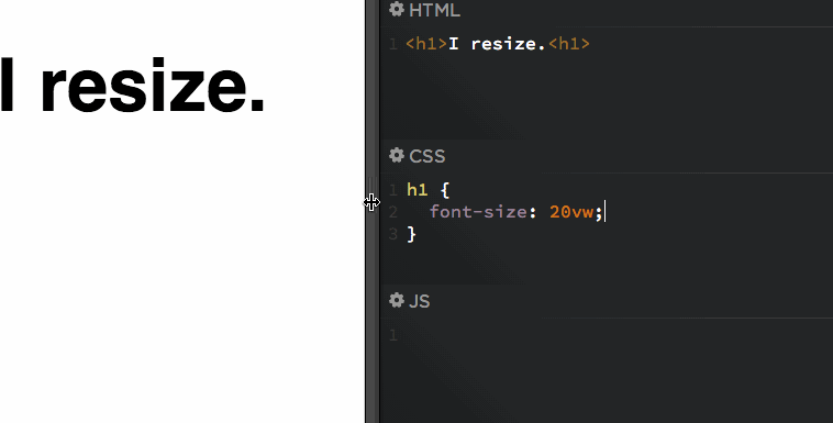
Here I am giving some examples to use viewport size typography.
h1 {
font-size: 4vw;
}
h2 {
font-size: 2.5vh;
}
p {
font-size: 1.8vmin;
}
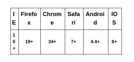
Browser support for Viewport size font

