
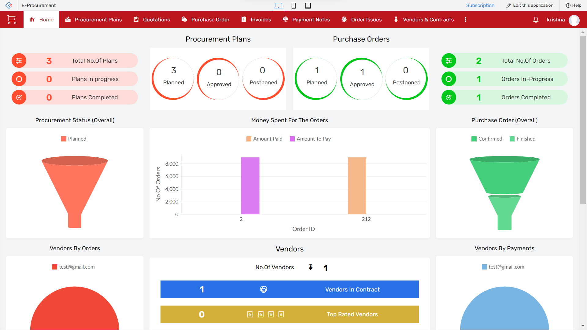
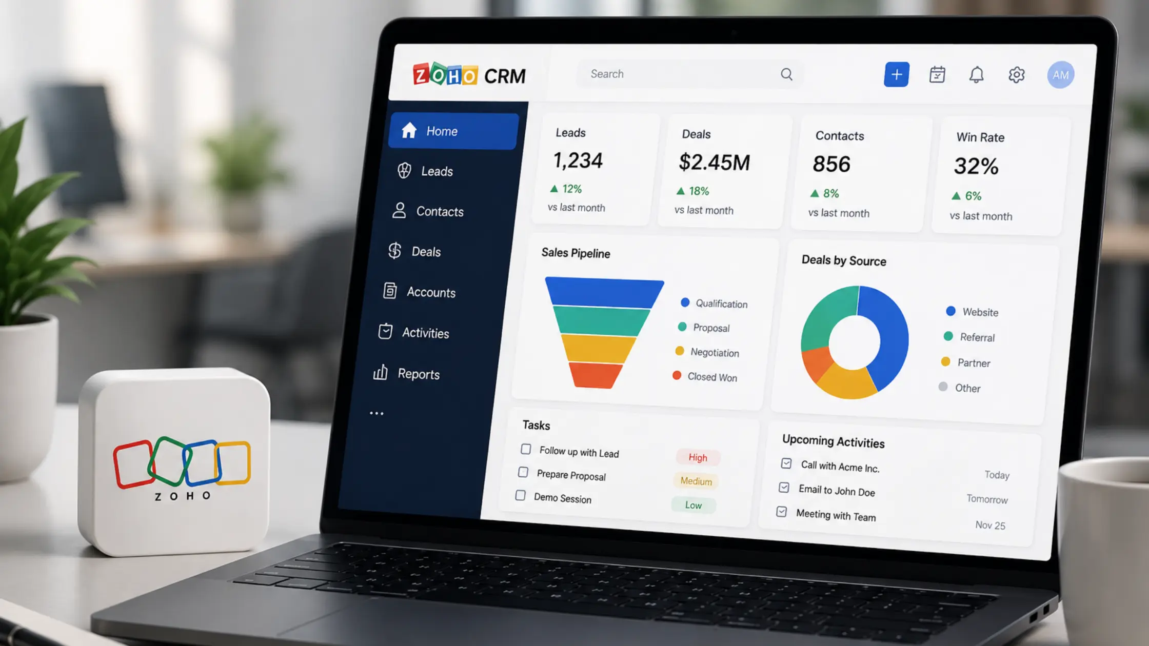
Nowadays, measuring, tracking, and managing the data is the main justification for gathering enormous amounts of information and producing reports to enhance decision-making and streamline numerous business procedures. As an application user, you use the Reports component to get insights once you have gathered sufficient data using various forms.
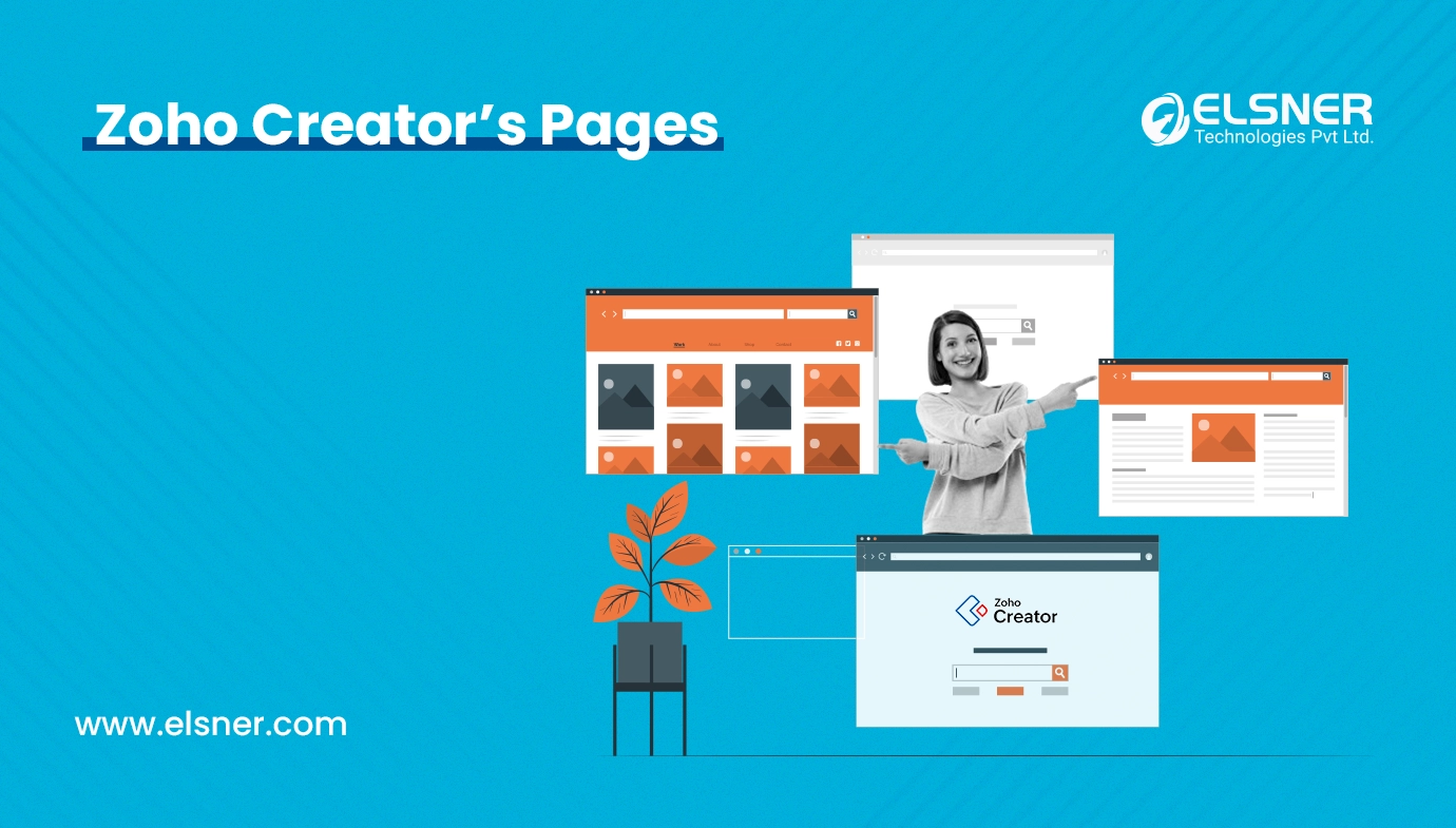
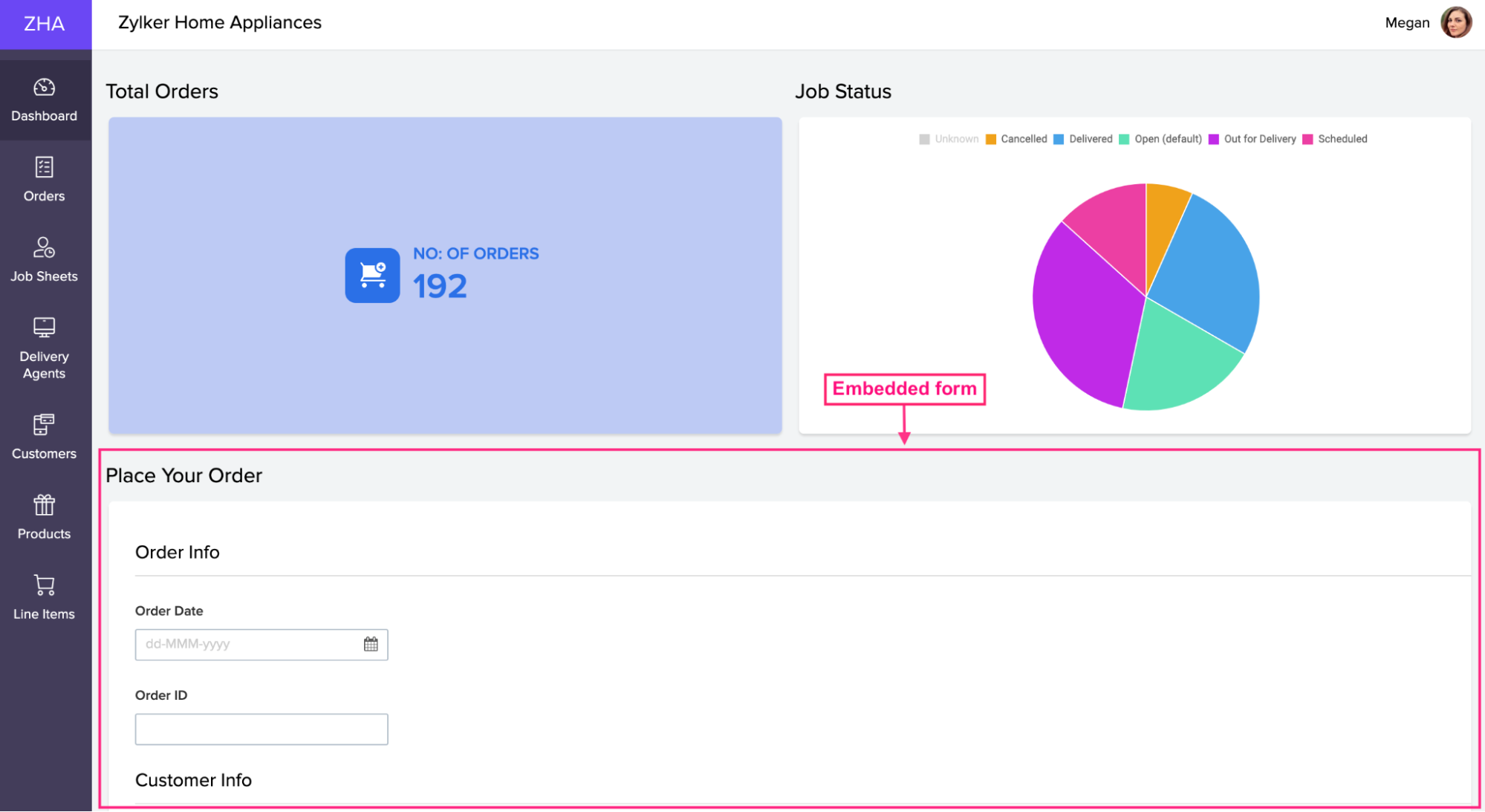
Pages in Zoho Creator can help you achieve this goal. Using pages, you can aggregate and extract values from collected data, convert them into manageable chunks of visual information, and create a detailed overview of your business on a single screen.
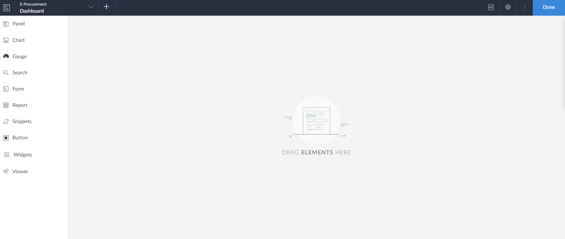
Page Builder
Within Zoho Creator , a tool known as Page Builder is available for the creation of personalized pages, graphics, and dashboards. This tool has an easy-to-use drag-and-drop interface that lets you create custom pages. Page Builder provides you with many pre-designed elements to put onto the builder and edit the interface. You can select panels, charts, forms, reports, snippets, or buttons.
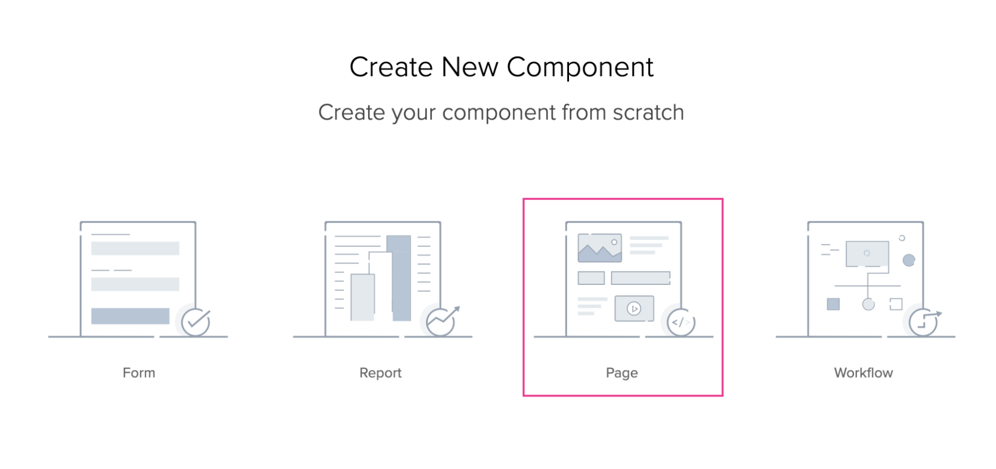
Create Page
Pages in Creator enables you to create customized pages, embed data from the application, and display it on the page. You can use various page elements to embed forms, reports, buttons, charts, and custom data. To create a page in an application:
1. Open the application on edit mode
2. Add a page using the + icon on the header area of the application builder
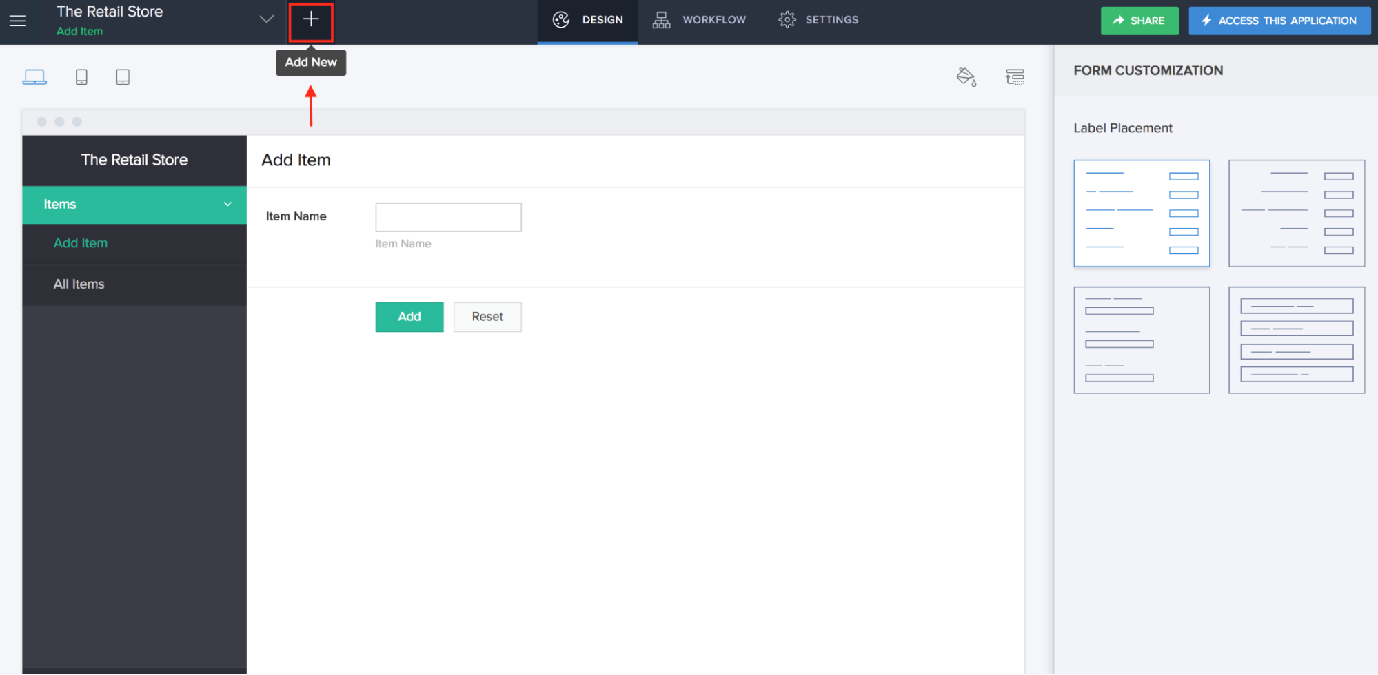
3. On the next page of Create New Component, select Page.
4. The next step is to select an option between Blank or From a template.
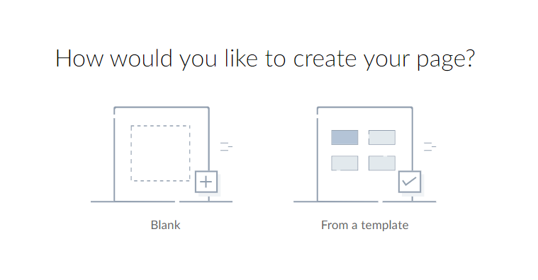
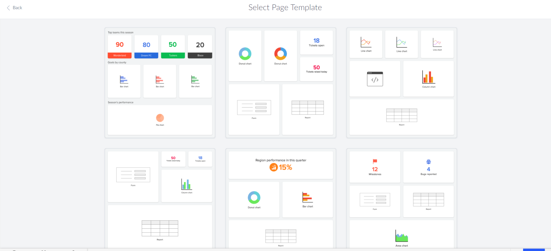
5. By selecting the From a Template option, it shows various templates on the next screen; you can select any of them and design your page.
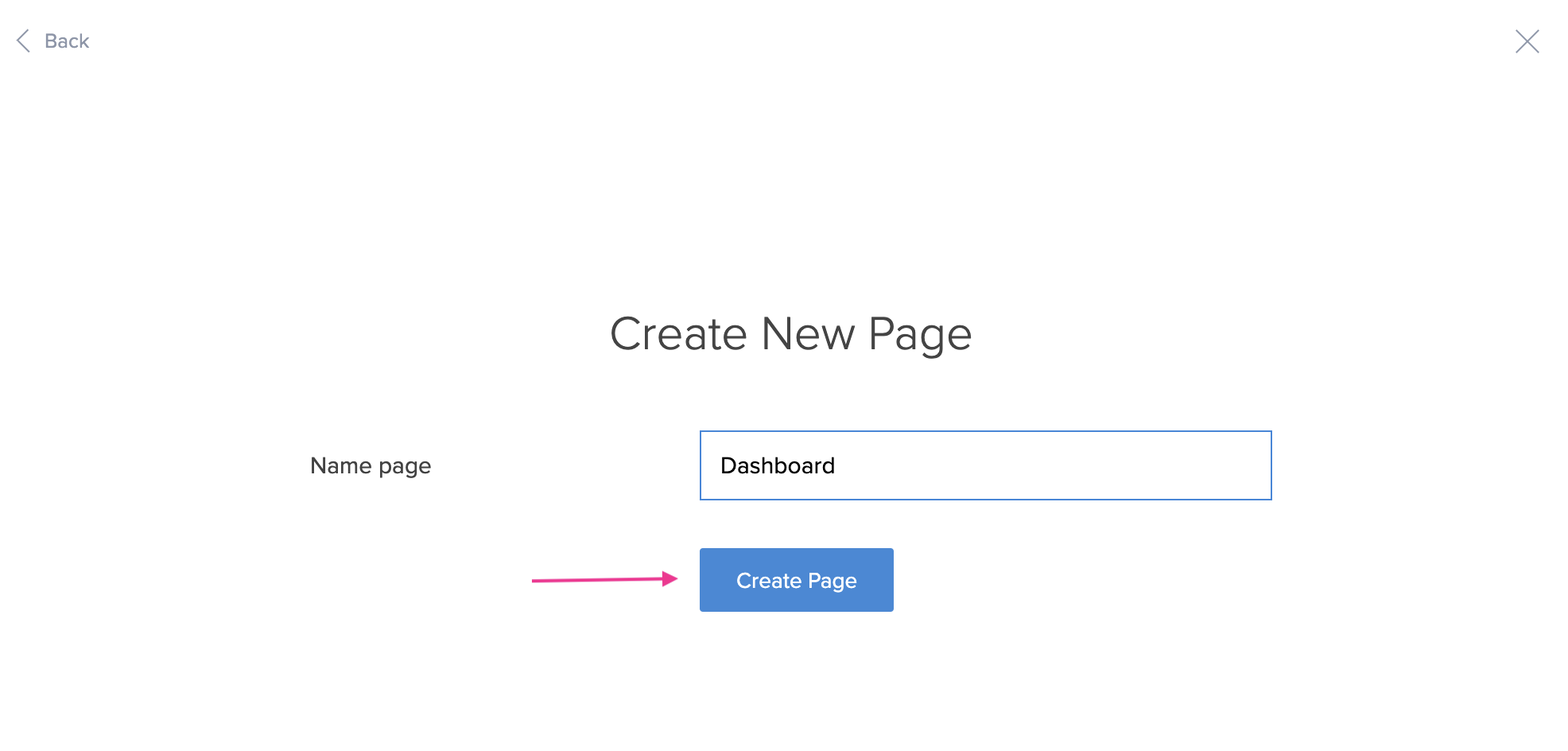
6. If you wish to design your page from scratch, you can select the Blank option, enter an appropriate page name, and click the Create Page button. You will be directed to the page builder area.
7. In the page builder, you can add and configure multiple elements, such as panels, charts, reports, forms, snippets, and buttons, to create customized pages. You can set page properties as well.
Page Elements
With a variety of pre-built Zoho Creator page elements, the consolidated view of the application can be shown on a page, such as
- Panel
- Chart
- Gauge
- Search element
- Form
- Report
- Snippets
- Button
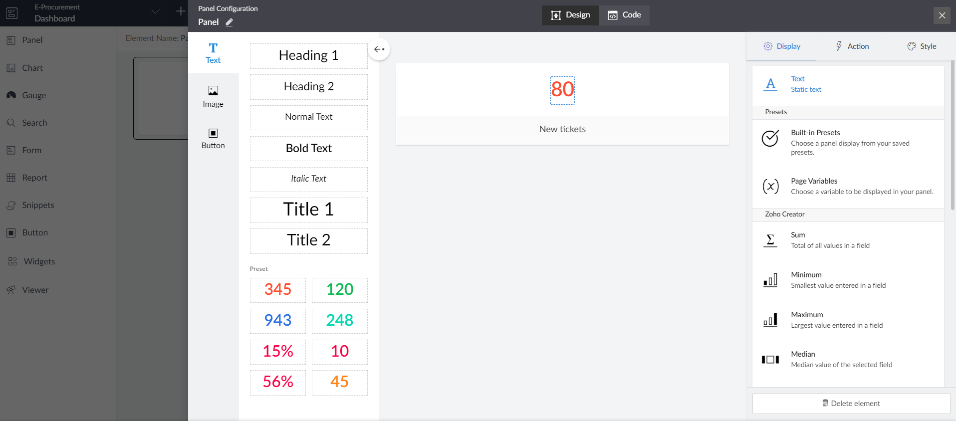
Understand Panels
Panels are primary page elements that serve as containers for specific information. When you select a panel, it shows Panel Builder for the configuration. Here, you can give a custom name to the panel.
Configure Panels to Page
- Builder area: The Panel Builder has a space in the middle for the builder area that allows you to arrange different objects/elements in the panel using a drag-and-drop editor and preview your changes.
- Element menu: The menu on the left side of the builder, normally opened by clicking the arrow buttons, offers a variety of options for text, images, and buttons.
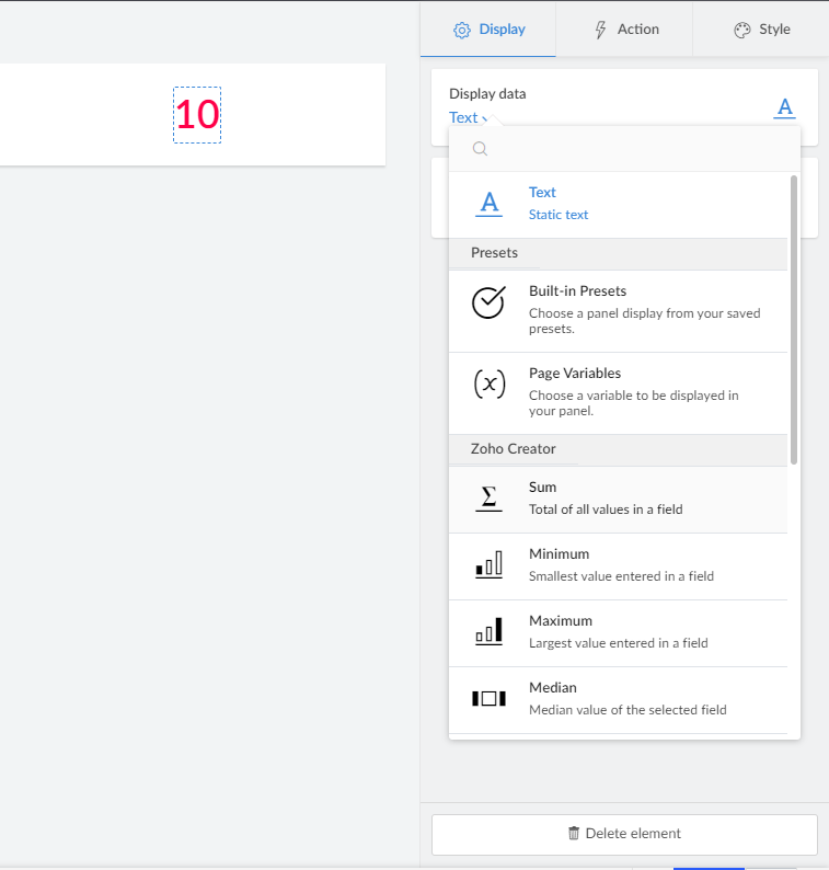
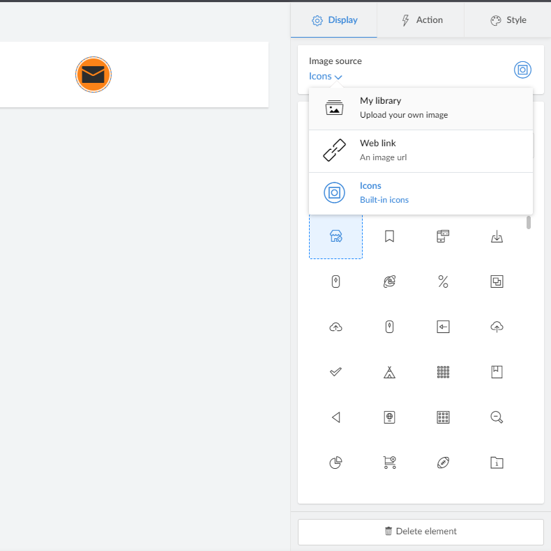
- Display setting: Each element has a different display configuration. Also, you can delete an element using the Delete Element option. Each panel may be used to feature exclusive sorts of content on the page, including
- Text: You can configure the textual content to be displayed on a panel. Display data can be static text or form data to configure its information. Aggregate the numeric statistics for a specific metric together with the sum, count, distinct count, maximum, minimum, average, and more to the calculated information.
- Image: You can configure the picture or icon content to be displayed on a panel. An image or icon can be changed from the Image source option.
- Button: You can configure the button to be displayed on a panel. The button’s label, type, and styling can be configured.
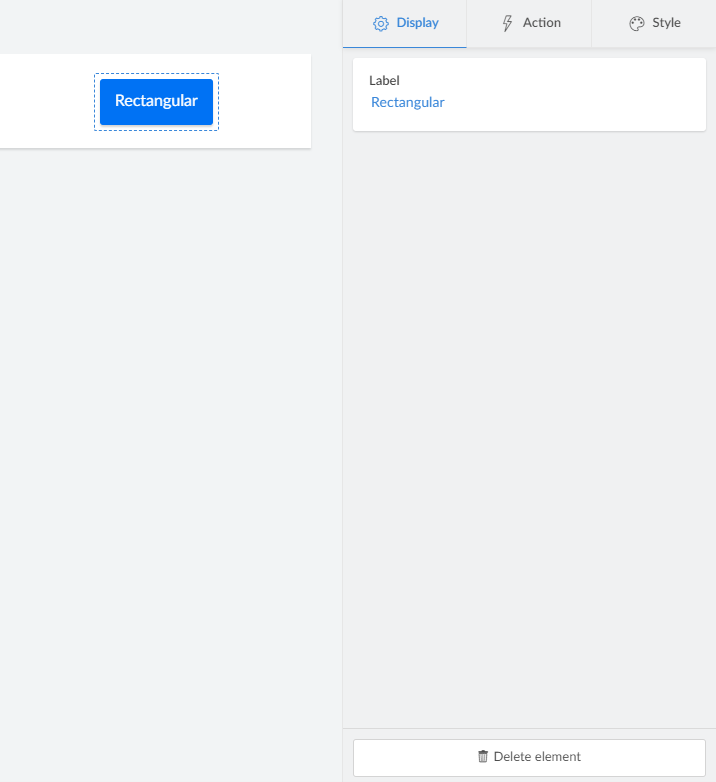
- Configuration actions: The menu on the right side of the panel designer is for the configuration. You can set up actions for any element of your screen from here.
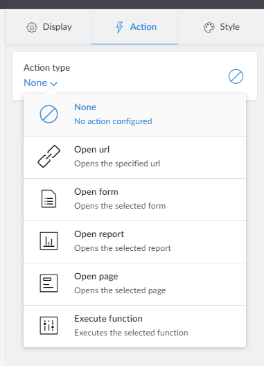
- None: It removes the associated action with the panel element.
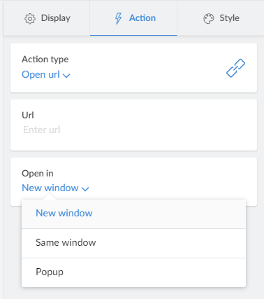
- Open URL: This action type redirects to the specified URL. Click to pick a text, image, or button element to accomplish the open url action. In the Url section, specify a URL to be opened. In the Open in the segment, pick out among
-
- New window – opens the related URL in a new window.
-
- Same window – opens the associated URL inside the same window.
-
- Popup – opens the associated URL in a popup window.
- Open form: This action type opens the selected form from the current application. Click to pick a text, image, or button element to accomplish the open-form action. In the Form section, specify a form that should be opened, and from the Query parameters section, you can pass parameters as well. In the Open in the segment, pick out among
-
- New window – opens the related form in a new window.
-
- Same window – opens the associated form inside the same window.
-
- Popup – opens the associated form in a popup window.
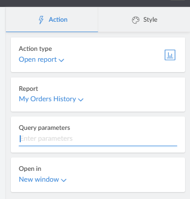
- Open report: This action type opens the selected report from the current application. Click to pick a text, image, or button element to accomplish the open-report action. In the Report section, specify a report that should be opened, and from the Query parameters section, you can pass parameters as well. In the Open in the segment, pick out among
-
- New window – opens the related report in a new window.
-
- same window – opens the associated report inside the same window.
-
- Popup – opens the associated report in a popup window
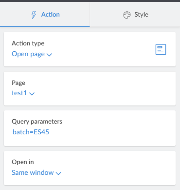
- Open page: This action type opens the selected page. Click to pick a text, image, or button element to accomplish the open-page action. In the Page section, specify a page that should be opened, and from the Query parameters section, you can pass parameters as well. In the Open in the segment, pick out among
-
- New window – opens the related page in a new window.
-
- Same window – opens the associated page inside the same window.
-
- Popup – opens the associated page in a popup window
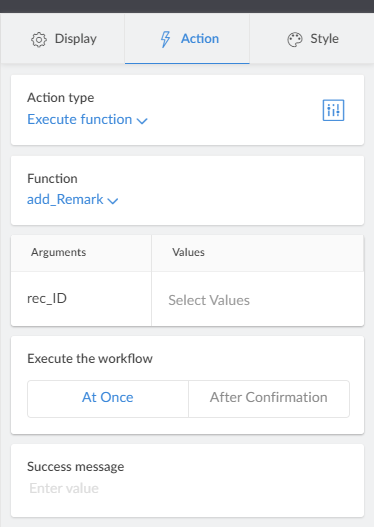
- Execute function: This action type executes the selected custom function of the application. Click to pick a text, image, or button element to accomplish the execute function action. In the Function section, specify a function that should be executed. It will show the required arguments for the function, and we can pass the values of the parameters. In Execute the workflow segment, you can pick between At Once or After Confirmation. Enter a success message to be returned on the successful execution of the function.
- Style setting: The menu on the panel designer’s right side is for the elements’ styling. You can change the style of any element of your page from here. You can change the styles, like bold and italic, change font family, button type, set up padding and font size, etc.
You can add, duplicate, delete, or reorder the elements of the panel using the controls displayed in the panel builder.
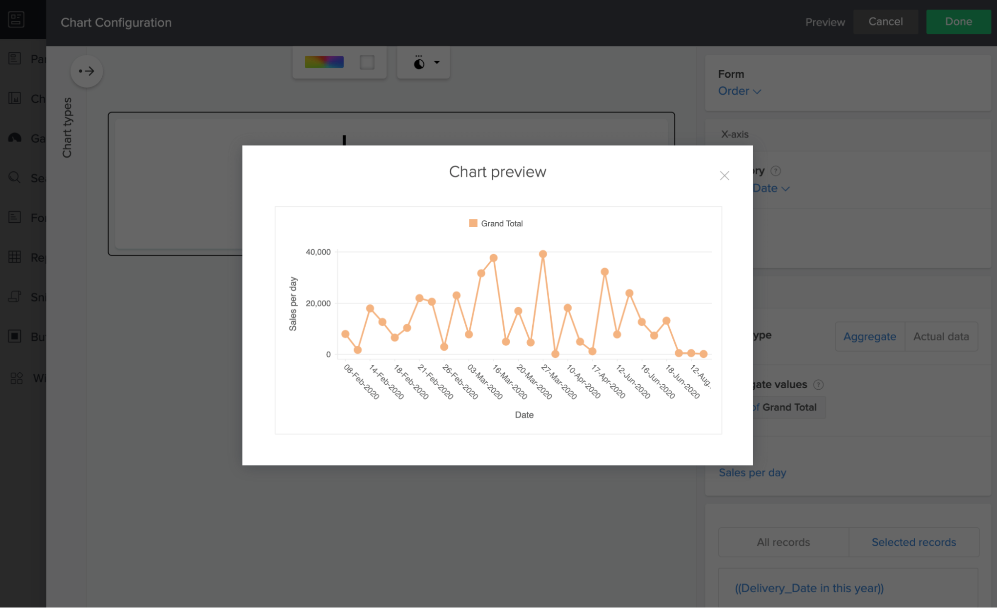
What is a Chart?
A chart is a graphical representation of information or data in which the statistics are represented through symbols, bars, lines, or slices. Charts make it easy to understand styles and relationships and also discover trends in large quantities of information or data.
You can create various charts on your page and configure them to be consistent with the requirements. Also, you can select an actual value or aggregate value, color, and set legend positioning. Types of charts the Zoho Creator page offers are column charts, bar charts, line charts, scatter charts, area charts, pie charts, and more.
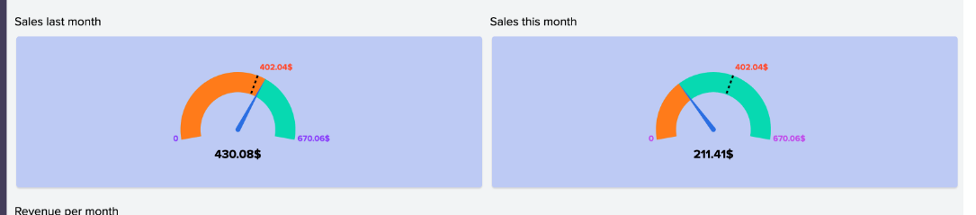
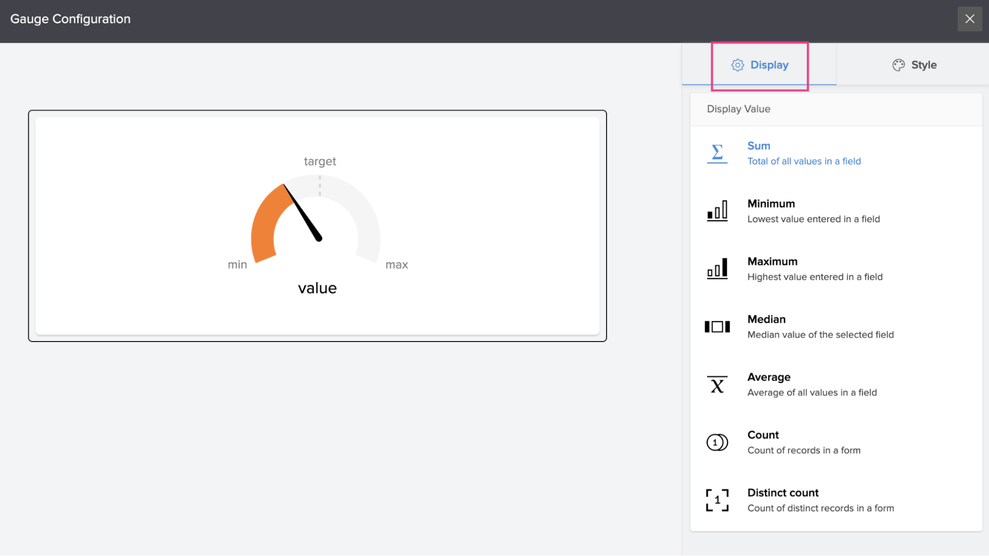
What is a Gauge ?
A gauge is used to visualize single-valued metrics, like sales overall performance for the year-to-date or other marketing and sales goals.
In simple words, a gauge visually represents a target and how your business metric is progressing in the direction of that target. This element is brilliant for showing KPIs.
For example, a gauge may be used to reveal the current sales progress of a team, sales of the last month, or sales of this month.
Configure Gauge to Page
- Open Page Builder
- Click Gauge from the menu on the left side
- Scroll to view and select a gauge type:
- Radial Gauge: Displays an arc around the pointer.
- Pie Gauge: A variation of radial gauge, where the scale forms a complete 360° circle.
- Linear Gauge: A horizontal representation of the pointers.
- Drag and drop the selected gauge onto the page builder area.
- Once you drag and drop the selected gauge on the page builder area, the gauge configuration menu will slide in from the right. You can configure your gauge and set up the style to gauge.
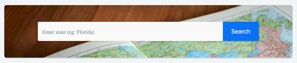
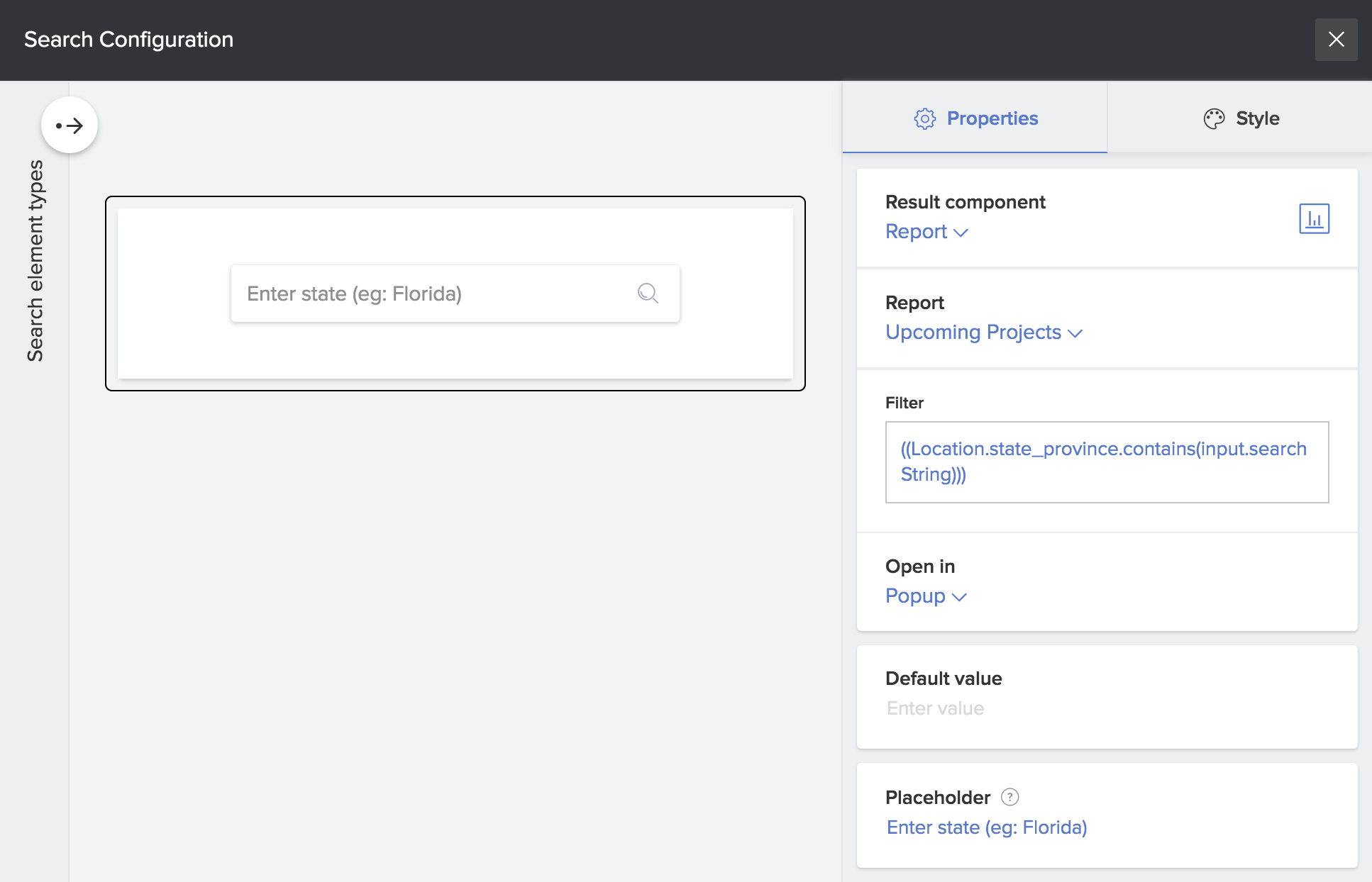
What is a Search element ?
The Search element on a page enables you to look for information or data across the applications to your Zoho Creator account. This element filters the page or report records based on the input you provided.
Below is how the search detail looks on a page:
Configure Search to Page
- Open Page Builder
- Click Search from the menu on the left side
- Scroll to view and select a search type
- Drag and drop the selected search onto the page builder area.
- Once you drag and drop the selected search on the page builder area, the search configuration menu will slide in from the right. You can configure your search element for a page or for the report and set up the style for it.
What is a Form?
Embedding forms inside the page makes it easier for the user to add data directly to his Zoho Creator application from the page itself. This saves the effort of having to leave the page, navigate to a form, add data, and return to the same page. Configure Form to Page:
- Open Page Builder
- Click Form from the menu on the left side
- Scroll to view and you can embed the form in two ways:
- Embed as Form: Form can be embedded into the page. You can configure properties to this form at the page level and also define field values to be pre-filled upon loading your form.
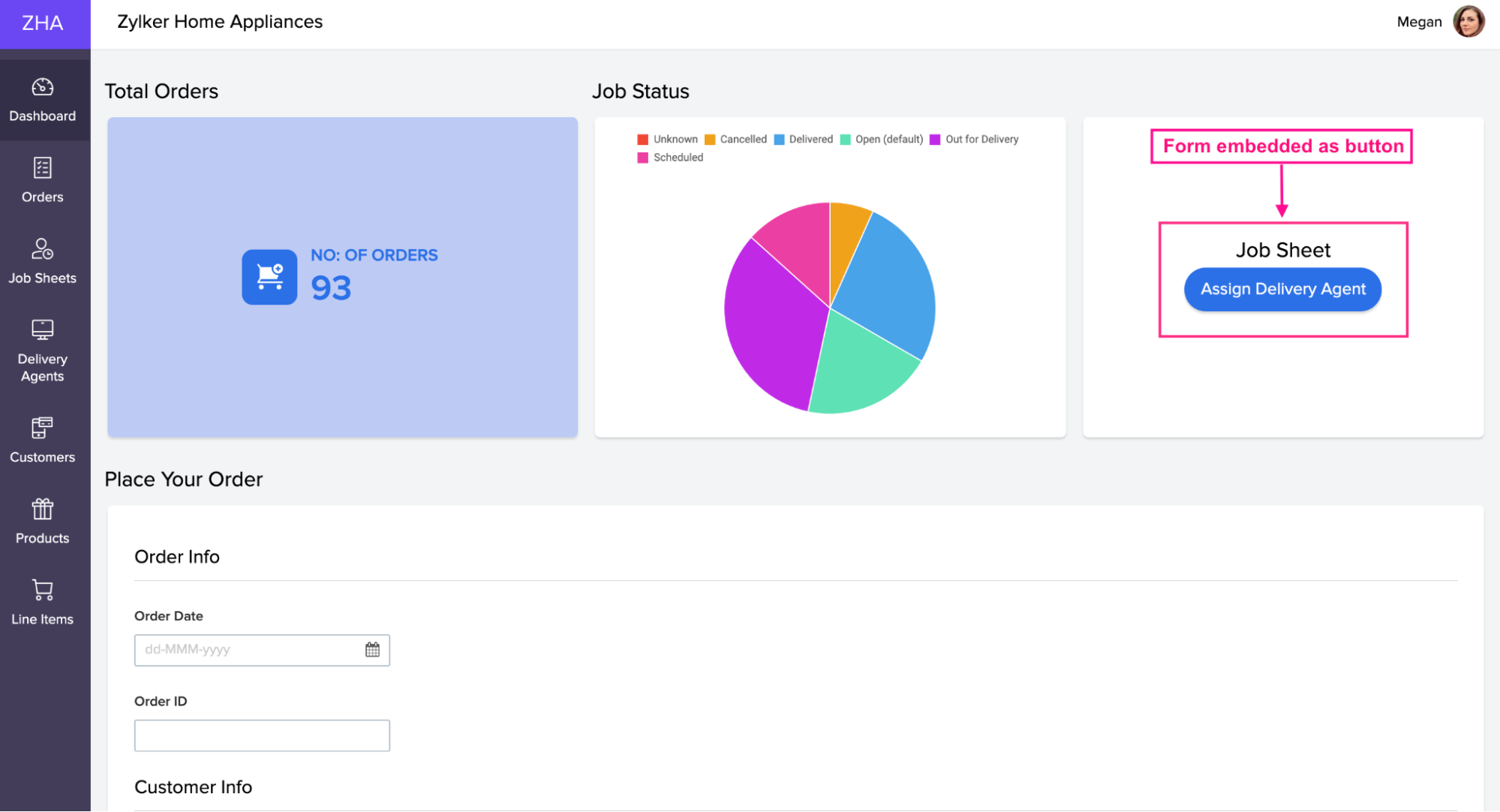
- Embed as Button: The form can be embedded into the page in a button format. Clicking this button redirects you to the form in a custom target location like a pop-up, same window, or a new window.
What is a Report?
Embedding reports inside the page makes it easier for the user to view and analyze data directly to his Zoho Creator application from the page itself. This saves the effort of having to leave the page, navigate to various reports, view data, and return to the same page.
Configure Report to Page
- Open Page Builder
- Click Report from the menu on the left side
- Scroll to view and you can embed the report in two ways:
- Embed as Report: Report can be embedded into the page. You can configure properties to this report at the page level and also define field values to be pre-filled upon loading your report.
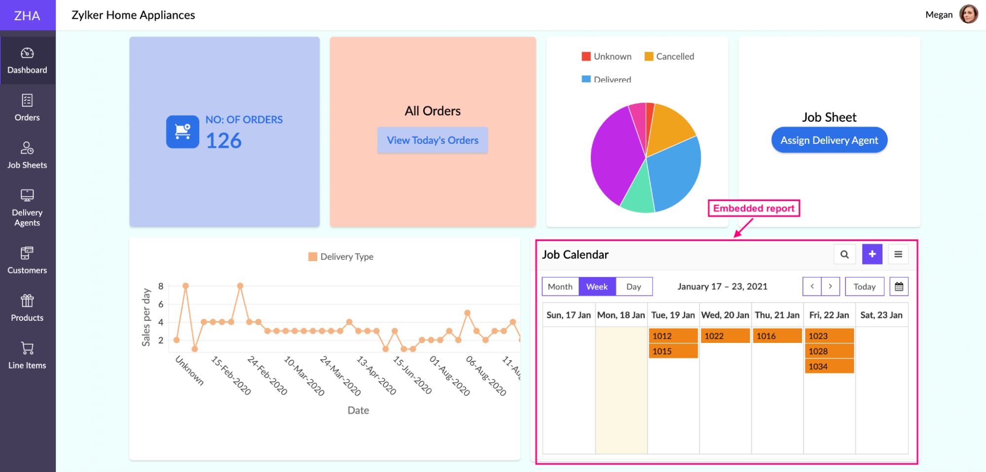
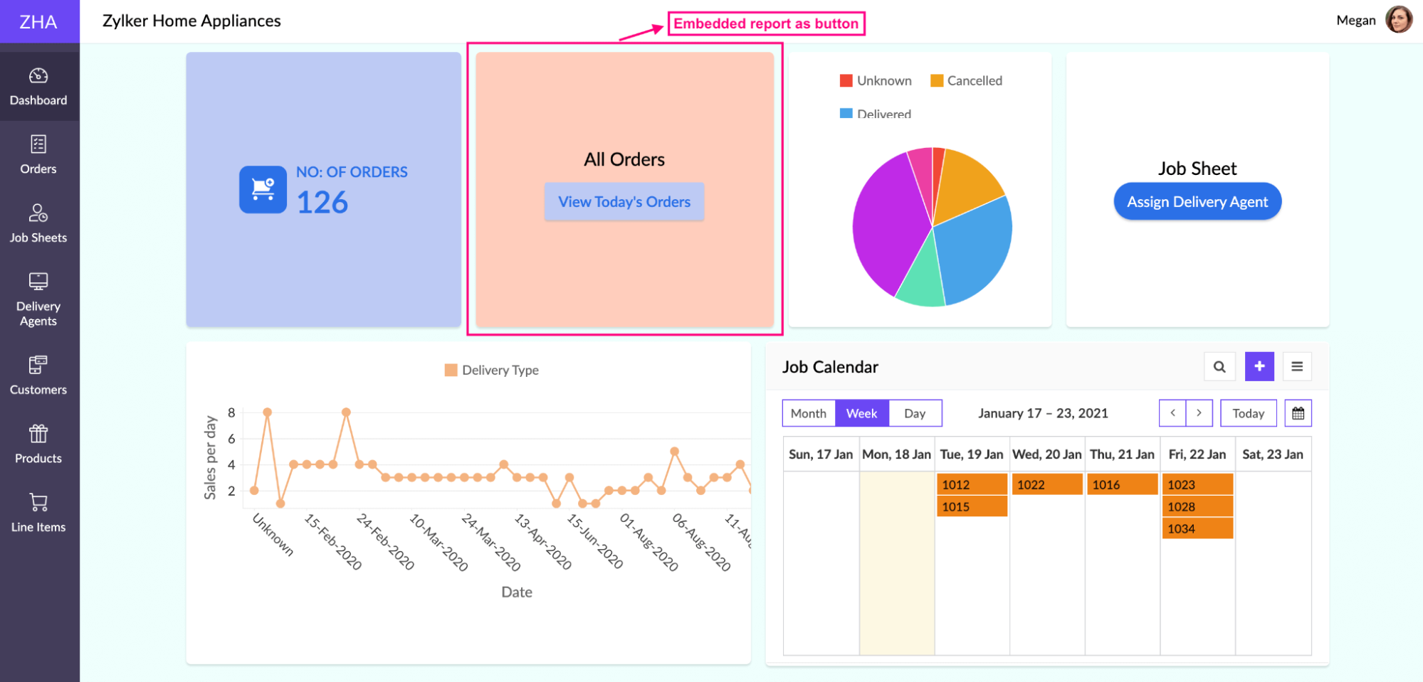
- Embed as a button: The report can be embedded into the page in a button format. Clicking this button redirects you to the report in a custom target location like a pop-up, same window, or a new window. You can style the button as well.
What are Snippets ?
Snippets are elements or components that allow you to add short, custom codes for your Zoho creator page. Conventionally, snippets are lines of reusable code pieces that could add more functionality. Types of snippets in a page are ZML snippets, HTML snippets, and Embed. For example,
- You can create a table showing values fetched from your application facts using an HTML snippet.
- Fetch and list out data from reports, based on conditions.
- Embed an iframe and set a value for it based on, user input
Wrapping Up
Zoho Creator is a low-code platform that allows users to create custom and interactive dashboards with information from different forms. You can design your own pages with just a drag-and-drop component. Users can add many elements to the page. It offers simple and easy customizable pages.

