
- What’s Responsive Design?
- What’s Adaptive Design?
- Adaptive versus Responsive Design: 5 Differences
- 1. Layout:
- 2. Reactive layout load time:
- 3. Difficulty
- 4. Adaptability
- 5. Search Engine Optimization
- Advantages and Disadvantages of Responsive Design
- Benefits
- 1. Seamless Encounter
- 2. Reduced upkeep duties
- 3. Improved Searching and Browsing
- Drawbacks
- 1. A slower loading page
- 2. Difficulty integrating advertisements
- Advantages and Disadvantages of Adaptive Design
- Advantages
- 1. Highly targeted for each user
- 2. Faster load times
- 3. Optimized for advertising
- 4. Option to reuse code
- Disadvantages
- 1. Labor-intensive to create
- 2. More work to maintain
- 3. Expensive
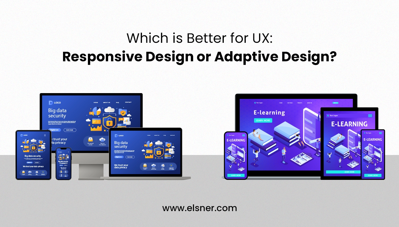
In the current digital environment, customers visit websites and applications using a variety of devices, thus it’s critical to make sure the user experience (UX) is ideal across all platforms. Two strategies to solve this issue are adaptive design or responsive design. Their approaches and results, however, are different.
What’s Responsive Design?
When a website has a responsive design, its elements “responsively” adapt to the screen size of the user, making it suitable for both desktop and mobile visitors.
Building responsive websites (usually with HTML and CSS or HTML5 and CSS3) requires knowing where to use queries to target breakpoints or places on the page where the layout changes to accommodate varying device widths. These breakpoints fit the layout on all screens, wrap text, and scale pictures.
All user interfaces (UIs) are viewed as one in this design style. You need to create one layout design, and the UI and content adjust smoothly.
What’s Adaptive Design?
For adaptive sites, designers create numerous fixed layouts to match the device a site is viewed on.
Adaptive design uses distinct layouts for multiple screen sizes, usually with templates for each device’s resolution. Designers often develop layouts for the six most common widths: 320, 480, 760, 960, 1200, and 1600 pixels. Tablets, smartphones, smartwatches, and monitors often have unique resolution ranges, so content must adapt to these to be viewed properly.
Adaptive sites use the CSS queries of responsive design but have JavaScript-based enhancements to change the website’s HTML markup based on the device’s capabilities. This is known as “progressive enhancement.” This design style doesn’t require multiple designs — just layout templates stored in a single location.
Adaptive versus Responsive Design: 5 Differences
Although they both satisfy users’ expectations for scalability, responsive and adaptive web designs differ in five key areas:
1. Layout:
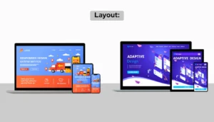
In a responsive Web design, a single layout adapts its display to the device or browser window. In addition to working with Windows, macOS, Linux, and other operating systems, the UX design is compatible with Chrome, Bing, Firefox, and Safari.
Adaptive layouts choose the layout to display based on the device or browser of the client. In order to provide the appropriate configuration, the server determines variables such as operating system and device type.
2. Reactive layout load time:
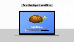
Most website construction software has features to expedite responsive layouts, although they are still somewhat slower than adaptive designs. They enable the automatic scaling of both static and dynamic images to match any device and resolution.
Flexible: Since flexible layouts only include the necessary elements, they are typically supposed to be fast.
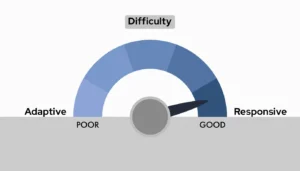
3. Difficulty
 Responsive
: These designs need more work up front because they only have one layout that works on all devices. To guarantee cross-screen functionality, this involves giving CSS organization more thought.
Adaptive: More work is required overall because each device class has a unique layout. Layouts can make use of the same elements, but each layout still needs to be designed uniquely.
4. Adaptability
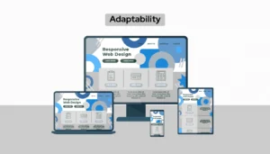
All websites, including responsive ones, require constant upkeep. However, when new screens are offered by the marketplace, responsive layouts do not need to be modified.
Screen resolutions and sizes are dynamic and adaptive. When adaptive layouts aren’t adjusted for the resolution of a screen, they can “break”. Since technology is always evolving, you have to regularly build fresh layouts.
5. Search Engine Optimization

Google provides advice and benefits to websites that use responsive design.
Advantages and Disadvantages of Responsive Design
Because it’s less expensive and requires fewer resources, responsive design is ideal for small to medium-sized businesses as well as startups. It’s also ideal for e-commerce sectors since it primarily includes paragraphs and images, which are the structural blocks of most e-commerce websites, and offers an effortless purchasing process for customers.
Let’s examine the advantages and disadvantages of responsive websites in more detail.
Benefits
1. Seamless Encounter
Visitors receive the same user experience on any device, be it a desktop computer, mobile device, etc. When they switch between devices and instantly recognize the site, this might establish a sense of familiarity and trust.
2. Reduced upkeep duties
A responsive design saves time and work to maintain because it uses the same things across all platforms. There is more time available for significant tasks like customer service, A/B testing, and content production.
3. Improved Searching and Browsing
Google uses bots, sometimes called spiders, that collect and index content from websites. If the crawlers can recognize those terms, Google can determine where to display your material on search engine results from pages, or SERPs, linked to relevant keywords. A higher position translates into greater visibility because most visitors only click on the top few results.
If there is just one version of the material on your page, visitors only need to see it once.
Drawbacks
1. A slower loading page
The need for responsive web pages to detect the device or browser before appropriately loading elements may result in slower load times.
2. Difficulty integrating advertisements
Ads might not appear correctly since they need to adjust for all screen sizes, even though your website will function on all devices.
Advantages and Disadvantages of Adaptive Design
For complicated websites that are already up and running but require a mobile version, adaptive design is the best choice. Likewise, it is suggested for websites that rely on speed or for creating highly customized experiences, such those that can adapt to a user’s location, connection speed, and other variables.
All things considered, adaptive designs are excellent if you want more control over how a site looks to every user. However, consider the following benefits and drawbacks:
Advantages
1. Highly targeted for each user
Users are more likely to have a positive UX when every gadget is optimized. You can adapt to a visitor’s location and connection speed, for example, to deliver area-specific search results and scaled visuals for slow connections.
2. Faster load times
It loads more quickly since it just loads the version of the website that visitors actually require. For devices with fewer processing power, you can also incorporate videos and graphics with a lesser resolution.
3. Optimized for advertising
You can obtain mobile device data for your customized layouts and utilize it to optimize adverts based on user data from smaller shows by adopting adaptive websites.
4. Option to reuse code
Especially useful for intricate website designs, adaptive design maintains legacy code in place.
Disadvantages
1. Labor-intensive to create
Technical details like where to place call-to-action buttons and arrange navigation bars need to be taken into account for every layout, which makes adaptive design more labor-intensive.
2. More work to maintain
Maintaining screen resolution changes requires you to update each layout version separately.
3. Expensive
Additional resources are needed for creation, upkeep, and technical assistance when using adaptive web design.

