

User Experience Design (UXD or UX) within website design is a way of improving the satisfaction of users by developing the usability, findability, and efficiency of user interaction within websites. Today I’ll list the proven tips that I have accumulated that any one web designer should know and utilize to enhance his or her website UX.
Tip # 1: Work with Flow
To make your website easy to navigate for your users, you need to place yourself in their shoes and understand your personas objectives. Think about the mindset of your persona, the fictional character you’ve created to represent the type of person who would use your website. What part of your website will they notice first?
The rather obvious answer to this is the top of the page, and the way one should lay the information out is to put the most important pages at the top where they are likely to be seen first by the person visiting your website. No one wants to have to scroll and dig endlessly to find the information they came for, so placing it at the top is very helpful.
Another important factor to include in improving the flow of your website is using consistent and convenient, easily understood user interfaces to ensure your persona can concentrate on the content they need and go through it unhindered.
To avert confusion and keep away from creating additional unnecessary work for your users, avoid creating dead end pages on your website. To evade further such confusion, refrain from using uncommon website patterns and interfaces, you don’t need to make your users learn something new, and it’s perfectly fine to use the common patterns and interfaces.
Tip # 2: Scrolling
As long as it is clear to your users that the information that is relevant to them is below the fold, they will keep scrolling. It is crucial to remember that your website should always have a clear visual indication of which direction to scroll in and should inform your users of whether there is any more material available.
A rather obvious, but often forgotten the point is that the longer your web page is, the less likely people are going to want to go to the trouble of scrolling down to the bottom of the page to find something they need. Provided your web page isn’t too long, running web pages are pleasant because scrolling is a lot quicker thank clicking.
Tip # 3: Contrast & Color
Since all manner of people will be visiting your website, take into account those who are colorblind – ensure your website designs are in greyscale so that all users can read the valuable information. Another pointer for color on websites is not to use the color blue in any other part of your text except for links, for it often either clash terribly with your background or simply fades away, becoming almost unreadable, something all web designers should know. Remember that screen glare can ruin your websites usability factor if you fail to be aware of the contrast on mobile websites.

To make sure your CTAs work efficiently, use one color for them and avoid using it for anything else. If you wish to make your text come forward on your background, use warm, bright colors because they stand out, whereas cold, dark colors tend to remain in the background.
Tip # 4: Improving The Loading Speed
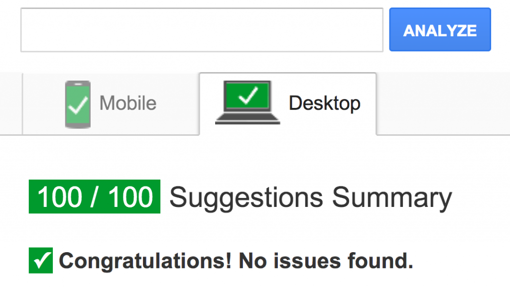
Website loading speed is one of the important SEO factors. As a professional SEO services provider, we always concentrating on improving website speed.No user enjoys waiting longer than three seconds for a website to load, so make sure delays longer than three seconds are improbable. When the website does load, ensure website users can complete their objective quickly and without any problems.
The perception of a website’s speed is based on factors such as load time, load behavior, waiting times and the smoothness of animations. To improve the understanding of these factors, show a skeleton of the website’s elements to show the user the layout while it’s still loading. If the user can see the text before the pictures, the person can read the text before the images load, so make sure the text loads first.
Related Post: 5 Ways to make WordPress website faster
Tip # 5: Make It a Heaven for Mobile & Tablet Users
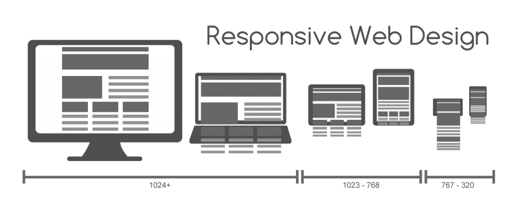
If mobile interface elements are small or placed close together, they are difficult to select accurately, so accordingly the minimum size for a touch target on a mobile should be 1cm x 1 cm with the appropriate padding. You can tell that your interface targets on your website or app are too small if the user has to use their pinky finger to access them.
Someone using a tablet to go to your site will find that the sides and bottom of the screen are most accessible with their thumb, so keep that in mind while creating your web page. When you begin creating mobile layouts, you should determine whether people will use one or two hands with their devices.
Tip # 6: Clean Navigation
Your website should as a rule have an easy to find navigation menu. If you come to the realization that your website hierarchy is huger than 3-4 levels deep, it’s probably time to rethink your website’s design.
If your website has long pages or you users require instant access to a particular part of your website, sticky menus are an excellent way to make access quicker and easier. Navigation labels must be accurate, ensure that they consist of no more than 2-3 words and that the most informative word is at the beginning.
Breadcrumbs are an excellent way of letting your users know where they are on your web page. Your navigation menu should disappear and not be on the way as well as not change through the website. When designing your mobile navigation, make sure the more frequently used options are on the top and hide all the less popular options under a hamburger menu.
These menus are less common and noticeable on desktops, as well as causing a rise in interaction cost and a fall in information scent. If you require secondary navigation on your mobile website, category landing pages, submenus or in-page menus are all suitable. If your website has megamenus, sort links into groups so as to tell apart clickable and non-clickable items. You must not hide the login and search features within your website menus.
Tip # 7: Forms
To provide users fast scanning, make sure form labels and fields are placed in a single vertical line. Your users shouldn’t have to deal with losing track of your field labels, so place them outside the text field. You have to make your web forms comprehensible, so split up the sections with separators.
Form errors should be placed next to the error causing areas within every web form. The provided error messages must be understandable, short and help the users. If you show all error – causing fields immediately, next to their respective problematic files, mobile users have less chance of missing the warning.
Related Article: How to Effectively Prevent Web Form Spam
I hope these tips come in handy with creating your website. It is always a struggle to create an amazing website that sells your ideas well. Keep these tips in mind, and you will find users of your website satisfied.
The author is Daniel Shane, a branding expert at Logo Orbit.


